TODO
Nothing.
DONE
The following changes have been implemented:
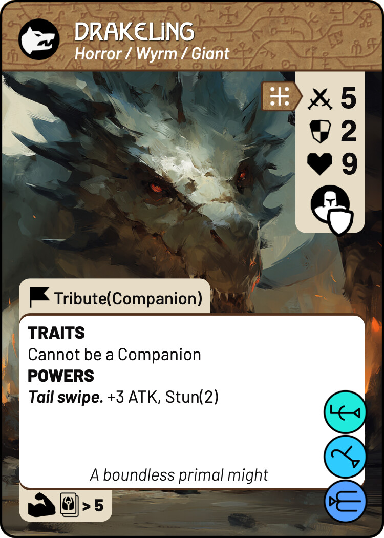
added outlined boost icons to stat block
relocated hunter/rooted to top left
relocated guarded to right-hand stat-block
moved memory spheres to bottom right to align with spheres on encounter cards; this makes them stack nicely in the Memories pile
moved companion “benefit block” to previous memory sphere location
With respect to the denizen template I think we have what we need to get to the next printed prototype – “black box playtest”.
I edited a few denizen cards to be more in line with your current designs. I like your decision to put one of the icons in the same box as the stats (I wish I had thought of that!), but I think it would be more logical to have Guarded there, as it’s a status that directly relates to combat. Hunter/Rooted on the other hand feels more like an identity rather than a combat status, so I feel it belongs next to the title.
@david

Completely agree – makes much more sense that way around!


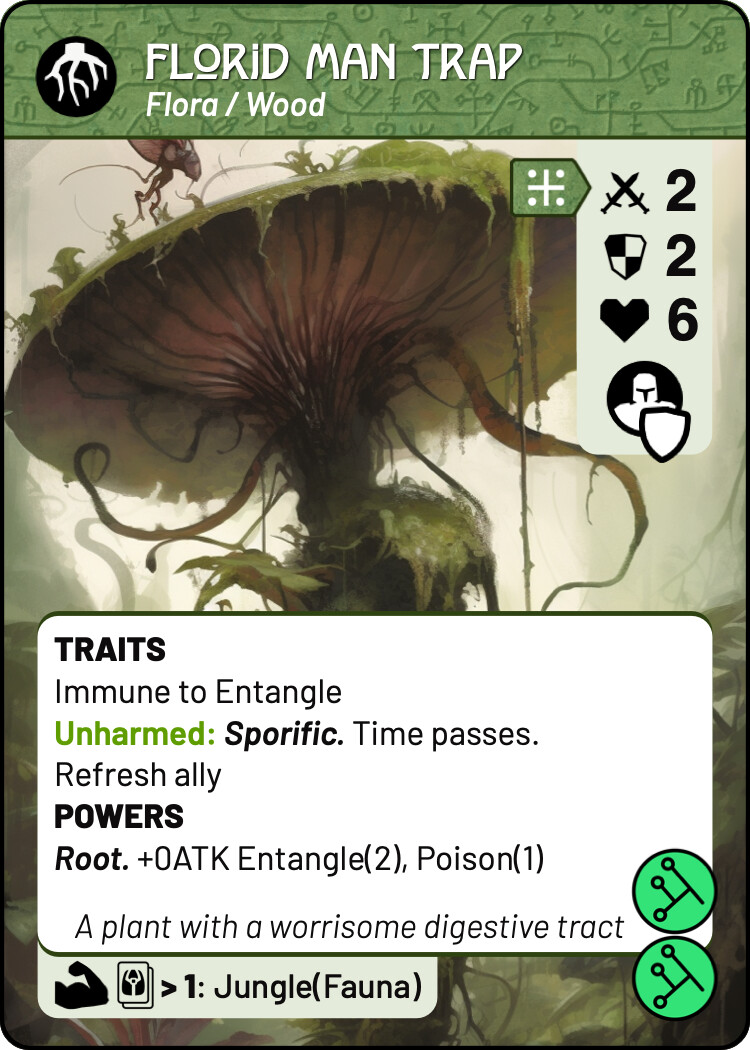
And having but Guarded next to the other stats, the next logical step is to consolidate it with the Boosted icon. It’s not a perfect comparison; boosted directly affects the ATK stat, while Guarded doesn’t affect DEF, but does affect how you can target the denizen. Still, I feel like it’s more congruent to reuse the icon location, rather than create a new one. The idea of this icon is the Guarded denizen hiding behind three shields of his minions. For this version I made larger icons for both Boosted and Guarded.
@david
I prefer the larger “guarded/elite” icon in the extended stat block. Its more of a statement that the enemy is elite, whereas the boost icon is a reminder that elite enemies are boosted when they attack.
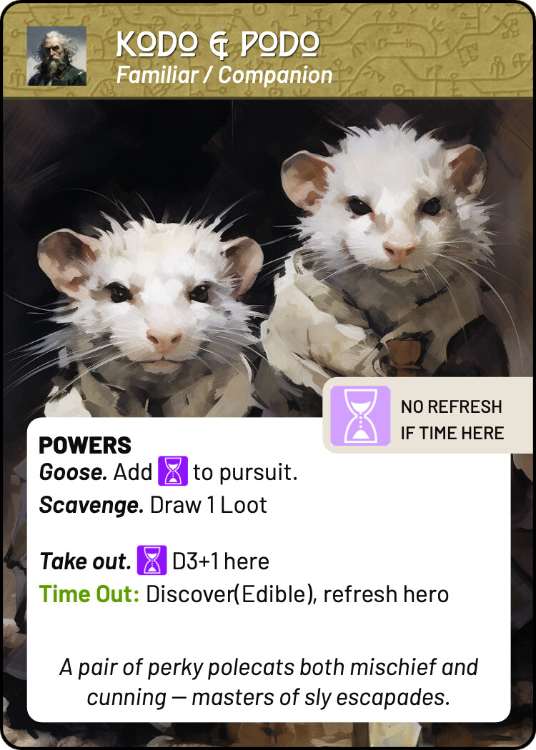
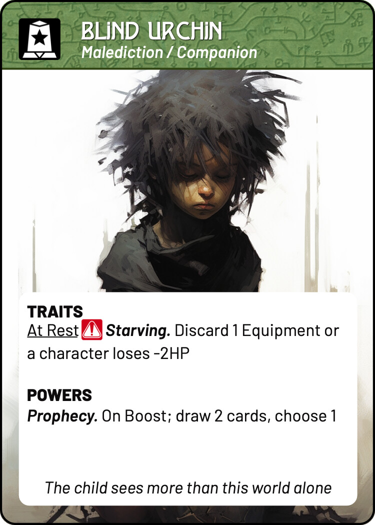
Tag icon for keywords. Rhymes with icons for malediction, familiar, even with the parley icons on items.
@david
Ideally all standard keywords should sit below the card’s title. If this is universal then there’s no need for an icon. I have removed familiar and malediction icons already – it all looks a bit too busy with an extra icon in there.
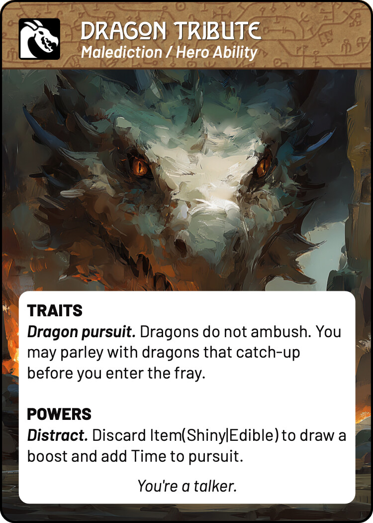

I’m still undecided with respect to Item cards as these are consumable and I think we need a different header treatment to distinguish them from more persistent cards in the hero tableau.
Some additional thoughts:
- How do you feel about separate icons for Trade and Recruit (you can see examples in previous designs I’ve sent)? I feel like we could save some real estate by not having the words Trade and Recruit there, just icons. It also makes this area easier to read.
I’m undecided. On the one hand i like the concept of an icon per parley action, but on the other hand I like the idea of a single icon declaring that “parley is possible”.
I have made a few changes with respect to the parley rules:
- a denizen only ever has one default parley option (or none)
- there are now three parley actions; tribute, trade, recruit
- you always lose your offering, and a few other mechanical changes for theme and balance
From a design perspective, the relevant changes are the addition of Tribute and the restriction of one default action per denizen (some denizens had two before).
Tribute solves several thematic issues I’ve had. Namely where you are flattering, paying off, bribing or distracting an enemy and do not expect anything in return beyond avoiding combat. It’s also a slightly different skill check – pass/fail.
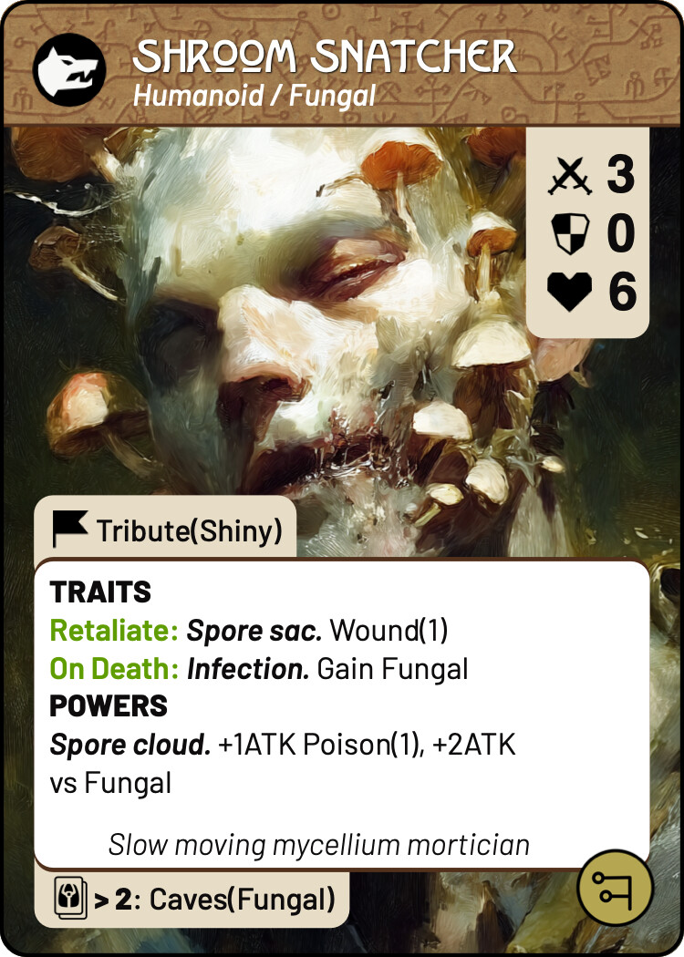

- Similarly, I feel like the programmer-style of writing, while it makes sense, is often hard to read. That’s why in these examples I tend to have ‘Wound 1’ instead of ‘Wound(1)’. From a programmer’s perspective I get that that kind of syntax is familiar, but in a practical sense, having no space between the word and the number is a bit hard on the eyes, while the parentheses serve no real function, especially if the word is bolded and coloured: Wound 1 . If we don’t have inline icons, making the text easy to read is really important. Not sure how tricky this is to implement with CSV and Multideck, though!
In principal I agree with this. We need to develop a more standardised typography as everything can’t be bolded or different colours. It’s not difficult to implement, but it touches just about every card and is time consuming. At this point I think we may need to hold off on these changes and get a prototype to playtesters.
That said, I do think you are right here.
- For the different text and stat boxes, do you want me to export them as separate loose images, or as an image that’s the card’s total size, with the text box in its correct place? (Can’t remember if I already asked this!)
It could be either – the complexity is always around areas that shrink/expand to accommodate text. Possibly the best approach is thinking in layers and having entire card layers with transparent regions.
- Also, for the text boxes, will it be easier to have one standard size for all cards, regardless of text amount, or do you plan on using dynamically sized boxes? I could export a few different sizes, then you can just drop in the one that’s closest to what a particular card needs.
I can’t expand/contract text boxes with a background image, but can with a background colour. I’ll discuss this in more detail in a different post, but in short i do not need any exports of this nature beyond the ones we have for quests for this phase. When we do a final pass on the layouts etc maybe we move to this then.