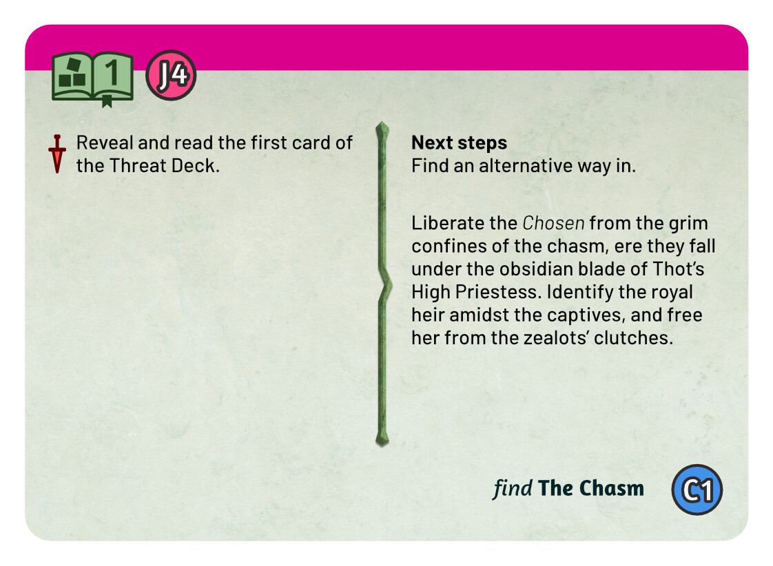
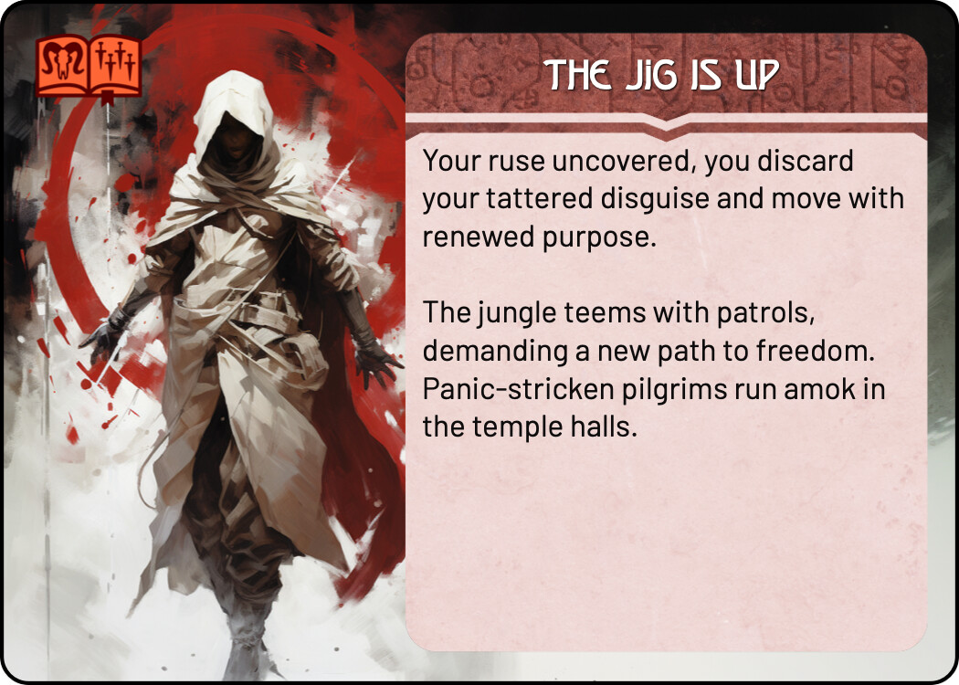
tutorial quest icon set; quest icon, quest book and threat dagger sets (happy to go with original monolith icons)
transparent lintel for front facing intro text blocks (for dynamic test block test)
Done
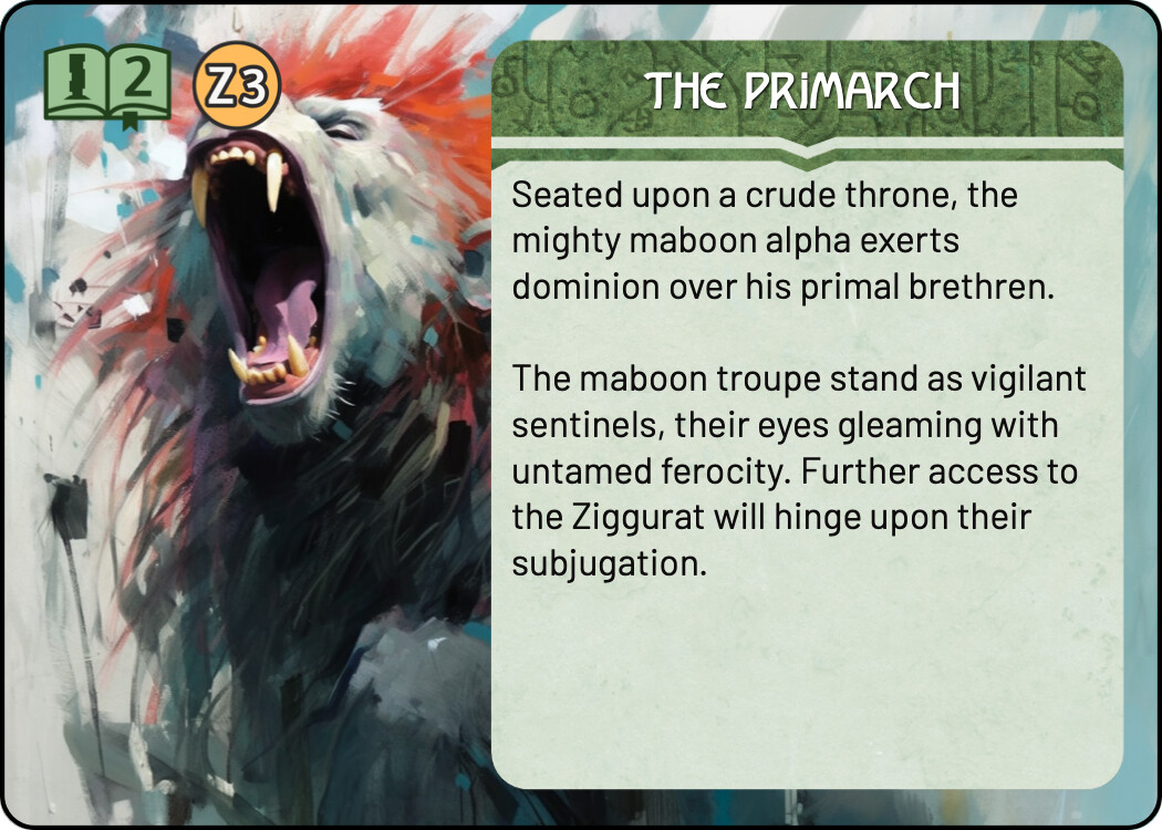
quest icons (all quests); isolated from book/daggers
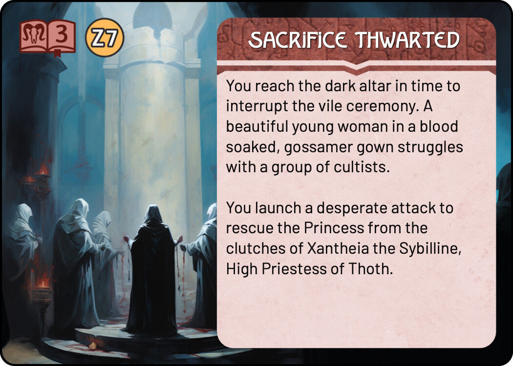
threat card: loot level icons (2,3,4)
threat card: loot match icons (order and chaos)
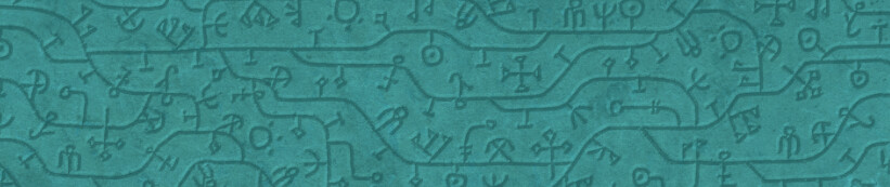
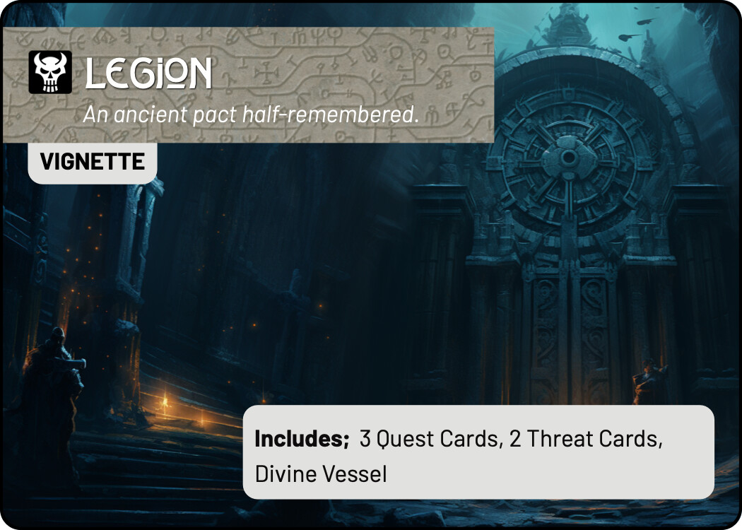
legion: background masthead image for quest colour pallete
WIP: Incomplete thoughts…
Trying to decide if the background “paper texture” has contrast issues with respect to quest cards – prints badly on my home printer.. but may be fine in production.
The purple paper background for TIME pools looks good on its own, but a bit manky when combined with the paper colour of the quest palette. Have included examples of just the purple, with an “enter the fray” call out in the colour of the quest palette.
In the Quest Card TODO list you mention “quest icon, quest book and threat dagger sets”. Do you mean you want all these as separate items (separate images for book, icon, threat book without dagger, dagger), or just the combined icons for each card? Because you should already have the latter. If you don’t, I attached them again to this mail.
Yep, got them. I just needed the quest icon in isolation for putting on “set aside” cards, and the quest manifesto (cover card).
I’m also unsure what you meant by " legion: background masthead image for quest colour pallete". In case you mean the text background images for the Legion quest and threat cards, I think you should have them as well, but just in case, I’m sending them again in this email. Let me know if I misunderstood!
The “lintel” (rectangle masthead for denizen cards) is what I’m using for the quest cover pages and hero cards. I only have these lintels for the denizen colour palettes. The TEAL colour palette used for Legion has not lintel image.
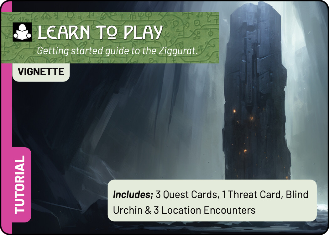
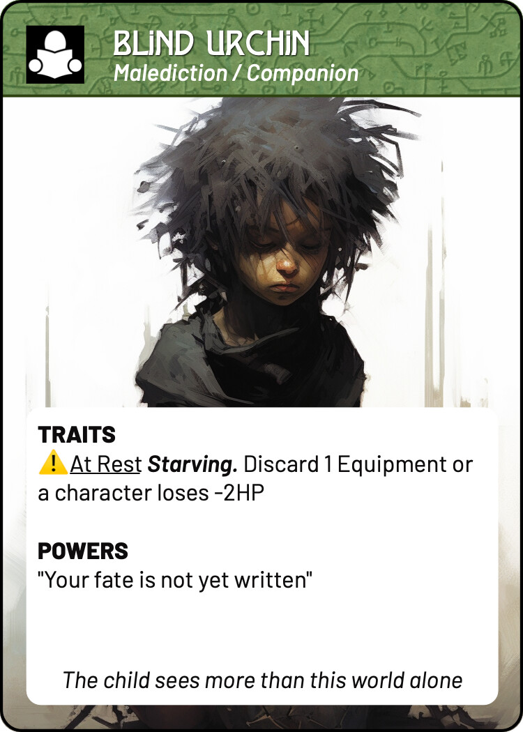
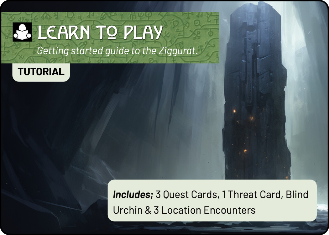
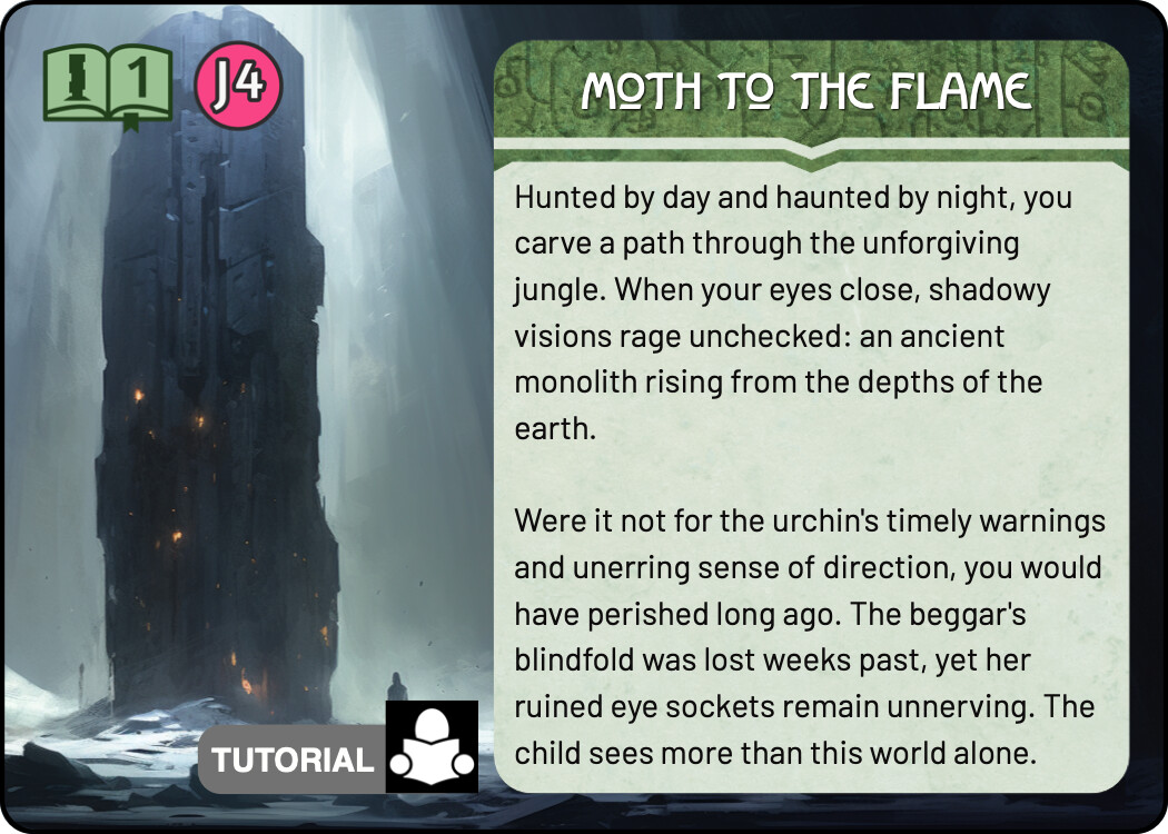
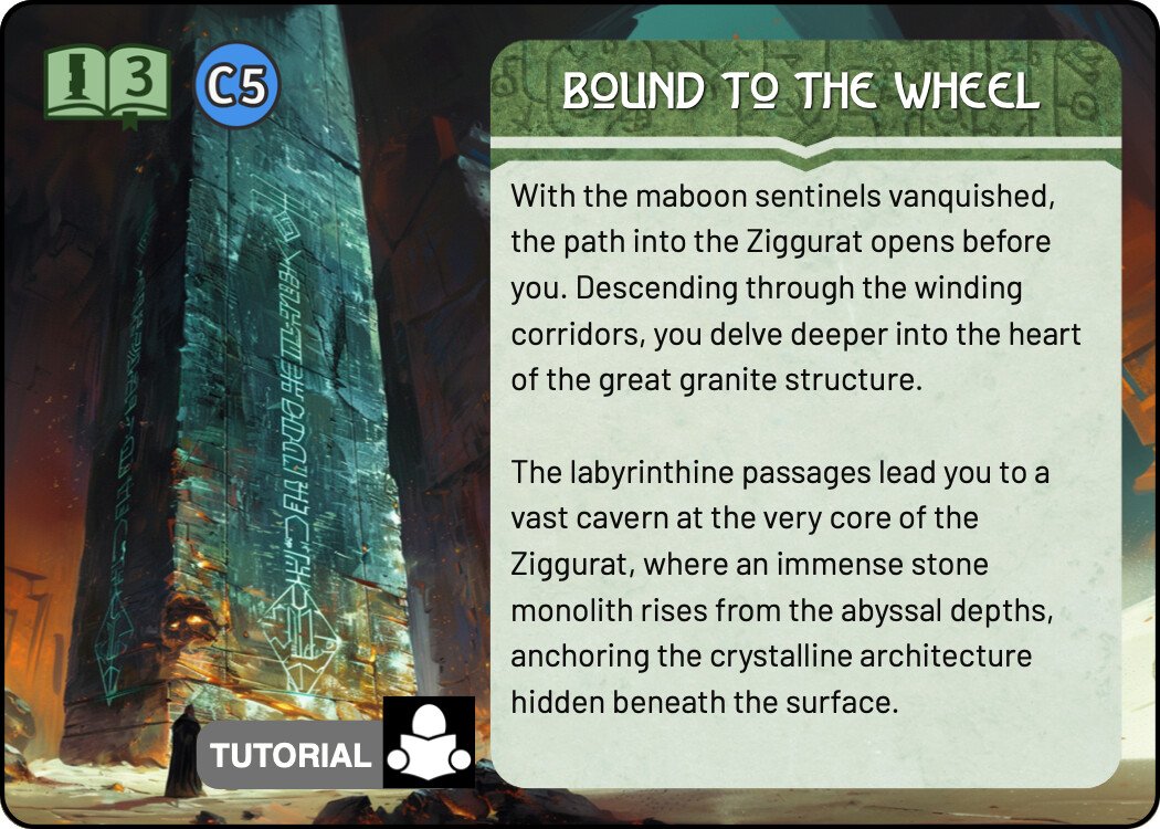
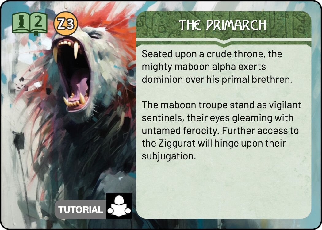
We don’t have a specific icon set for the short tutorial quest. I was going to use the Monolith iconography but i think its just confusing. I’ve looked at changing the image etc. But I think ultimately it would be best to have a different icon and palette colour to make them clearly separate.
Also, for the text boxes, will it be easier to have one standard size for all cards, regardless of text amount, or do you plan on using dynamically sized boxes? I could export a few different sizes, then you can just drop in the one that’s closest to what a particular card needs.
I can’t expand/contract text boxes with a background image, but can with a background colour. I’ll discuss this in more detail in a different post, but in short i do not need any exports of this nature beyond the ones we have for quests for this phase. When we do a final pass on the layouts etc maybe we move to this then.
Well this has very recently changed. Multideck now supports background images for dynamic text areas. This isn’t a silver bullet and I’m not sure whether or not the background image will get stretched or distorted – will have to play around.
To test this I need a slight variation on the following existing assets:
With any luck I can get the BG paper texture to anchor at the top of a text box and be revealed as the text box extends. But in order to get that to work I need the “lintel” (teal in this example) to just be the teal (and any feathering) with transparent background so it can sit on a layer at the top of the text box.
It will allow us to make the bottom of the front facing text blocks snug with the text length.
This forum is great to keep track of the different things we’re working on. Not sure if uploading images here compresses them or sends them intact, however. Here are a few image, but I’ll email them as well in and you can tell me which way you would like me to deliver files!
Included is a gray version of the stone text background, to be used next to the purple Time pools. Let me know how it looks.
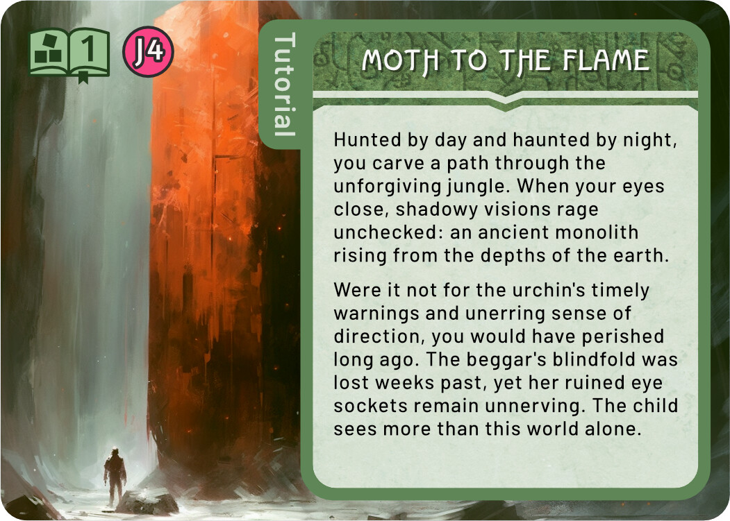
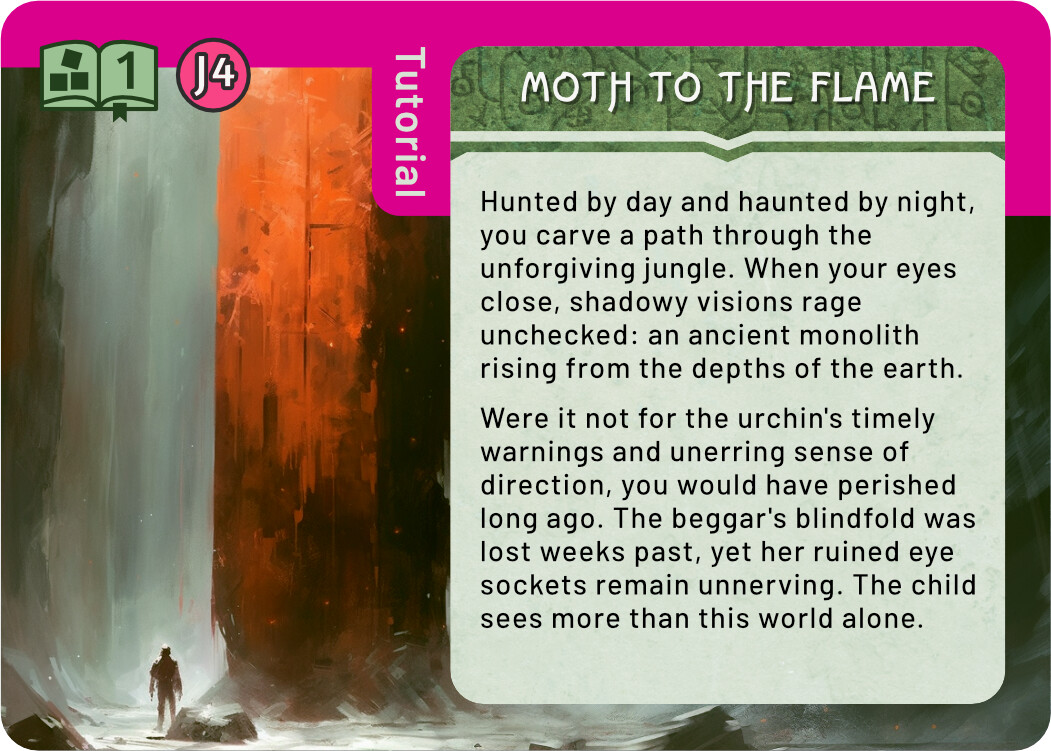
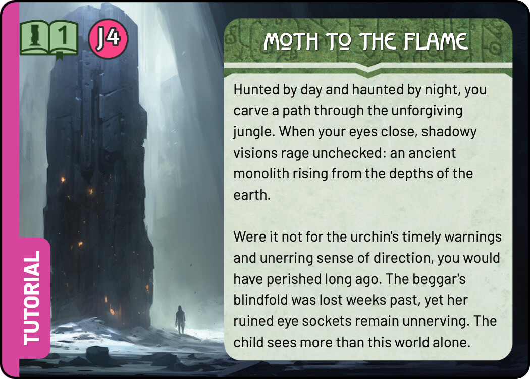
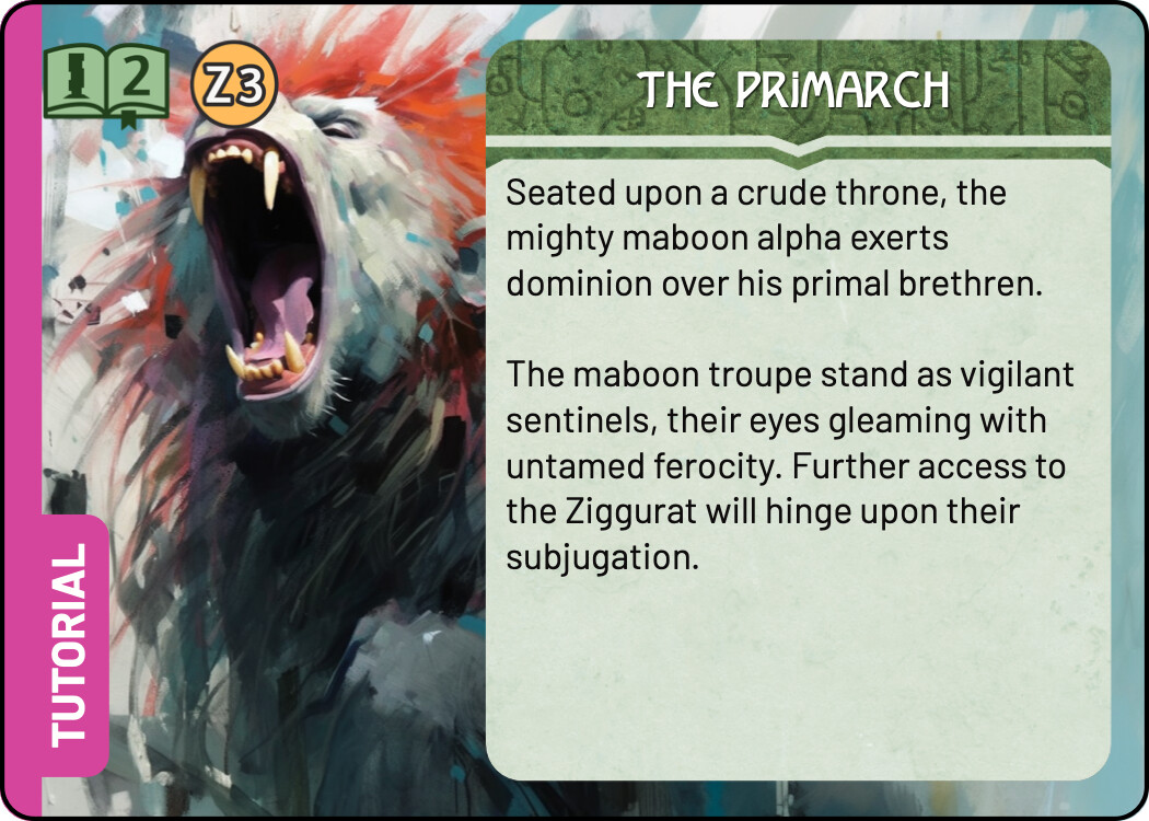
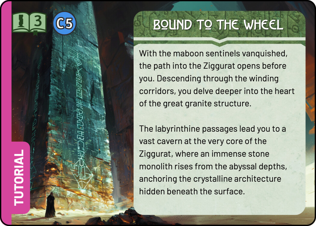
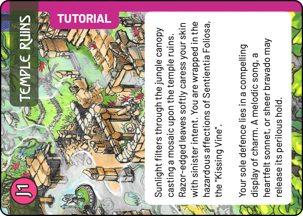
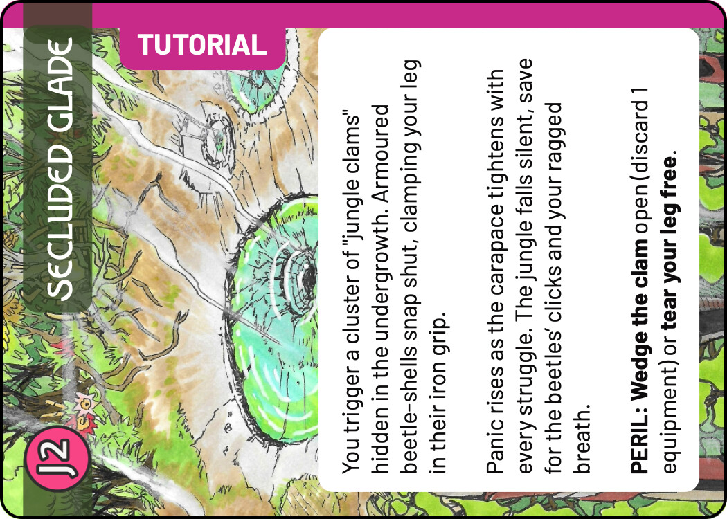
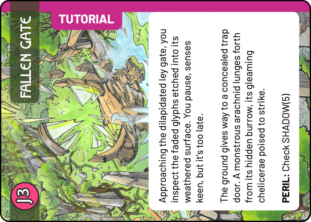
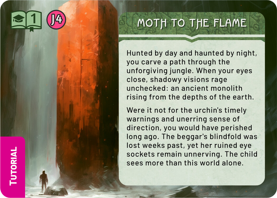
And finally a few quick sketches for the Tutorial. I think keeping the tutorial colour scheme the same as the real Monolith quest is not a terrible idea - it tells you that this is really the same quest, but simplified. At the same time, I liked the blue line you used in the previous prototype, it easily sets those cards aside. For these sketches I chose the complementary colour to green, an eye catching magenta. There are many ways to use this accent colour, these are some quick and dirty ideas.
One version doesn’t have the magenta, just green. It does say tutorial, but I don’t think it’s as easily spotted and could be confused with a regular quest card.
The quest icon are three building blocks, like children’s wooden blocks. Since the actual Monolith icon sort of looks like stacked blocks, this also works to tie the tutorial to the actual quest. One of the versions has an alternative icon, an American graduation hat (do you have something similar in Australia?). Not very fitting to the future/fantasy theme, but quite clear in meaning.
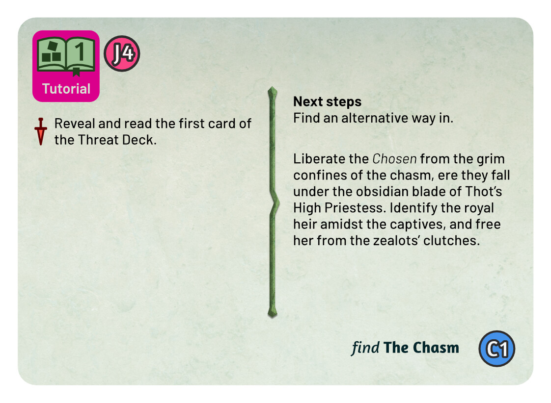
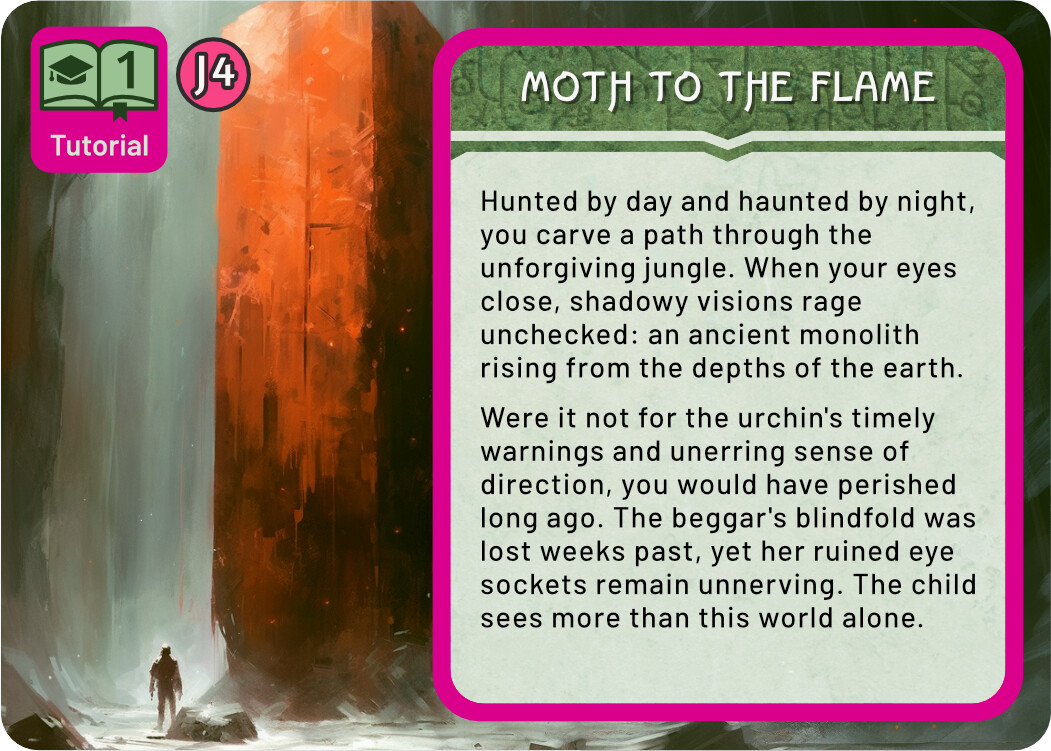
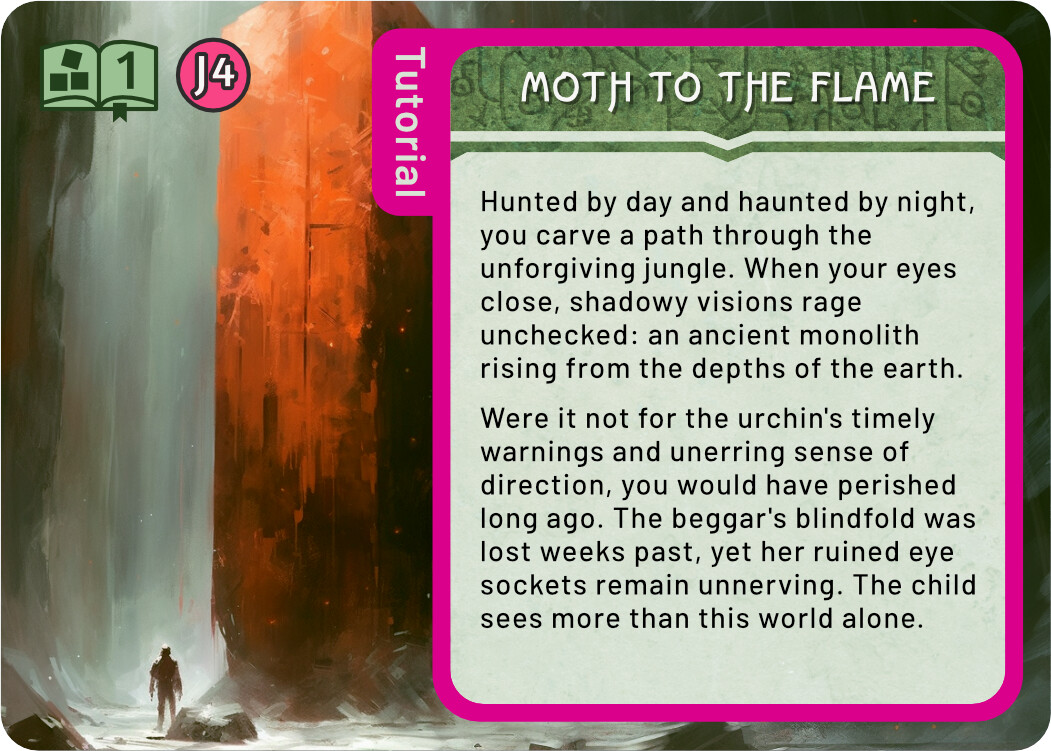
I think you’re right. It’s less about differentiating the quest and more about making it easy to find and extract the tutorial specific cards – they need to be removed post tutorial. I’ve gone with a simple pink strip on the left hand side for landscape. Has the added benefit of being created programmatically.
Here’s a copy of what I wrote in the mail with the files I just sent you:
[Attached to the mail] are files with separate transparent lintel and text boxes for the Quest cards. I made the text box the maximum height, that is the total height of a landscape card, minus 3 + 3 mm for the safe zones. If you need it in another height, just let me know!
I included two versions of each text box, one with the rounded corners that we’ve been using, and one with square corners. I suppose Multideck is going to reveal different amounts of the text box image and add its own radius to the corners, so I guess the square version will be best for that. For reference, the radius I’ve been using for these boxes is 2,8 mm.
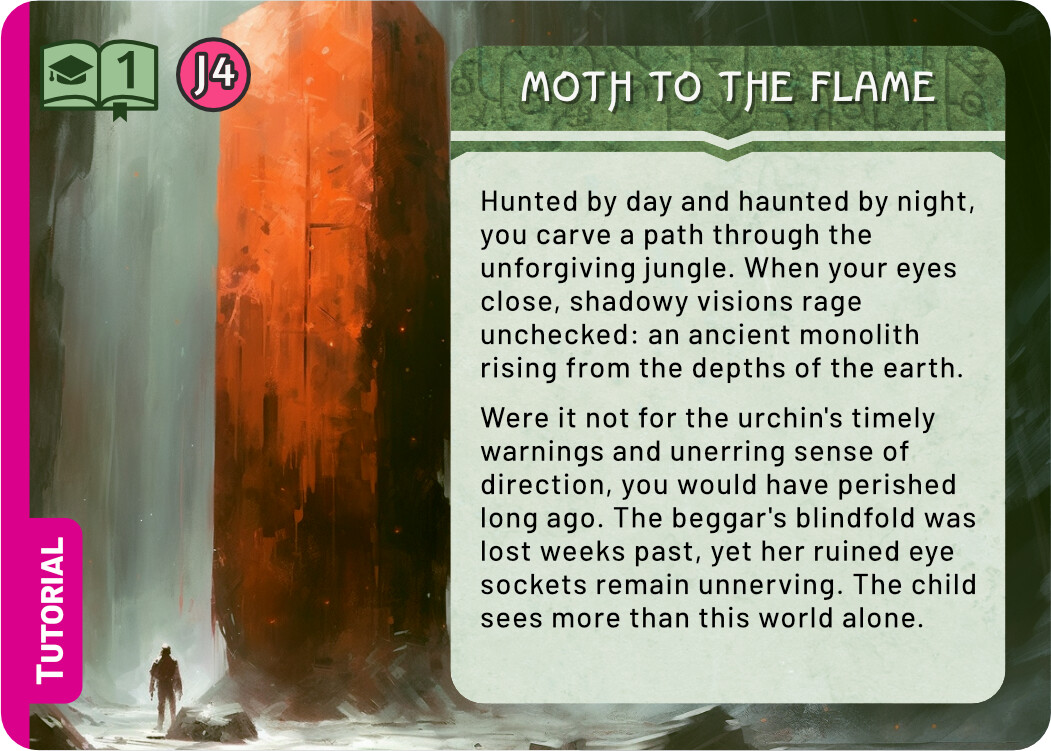
I like the simple strip to the left! Only right now it’s uncomfortably close to the edge of the book. Either move it away from the book, or make it overlap clearly.
I like the overlap - it ties together the word Tutorial with the book icon, saying “this is chapter 1 of the tutorial”. As long as this thicker strip doesn’t interfer with the design of any other cards that needs it, it might be a good choice.
Or you could avoid the book altogether and just have a small tag down in the corner. Here are examples:


