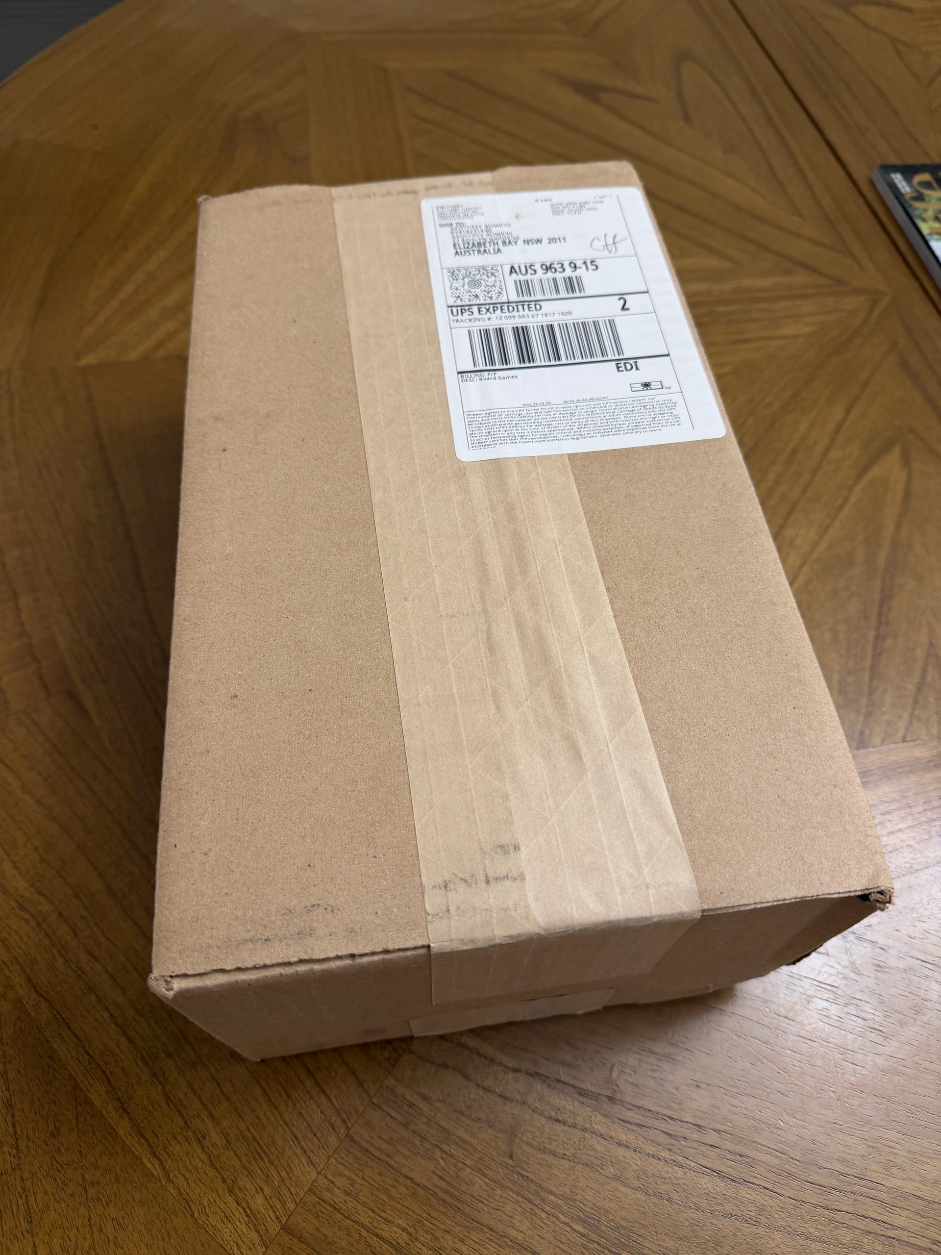
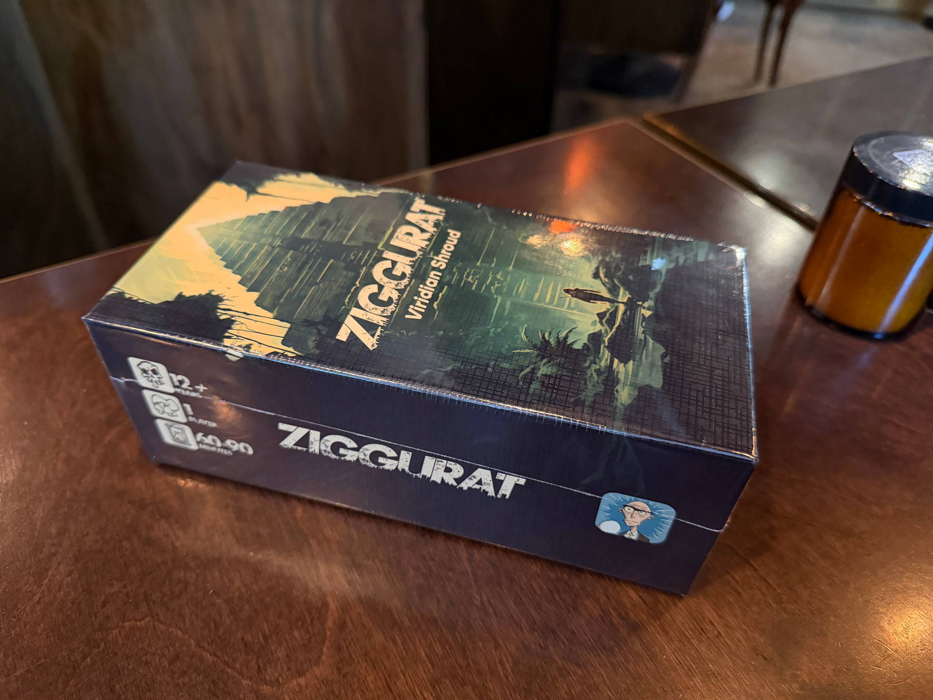
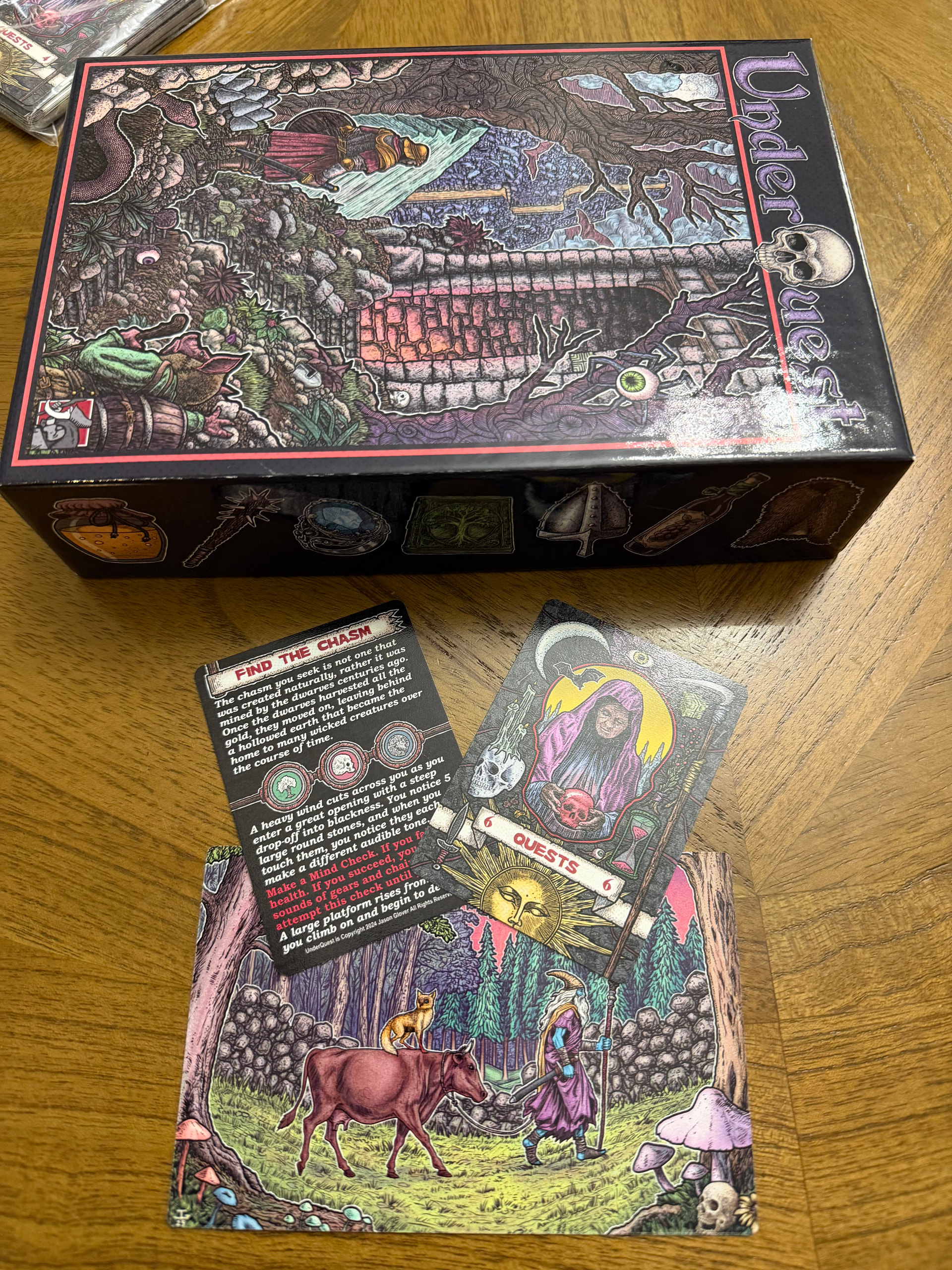
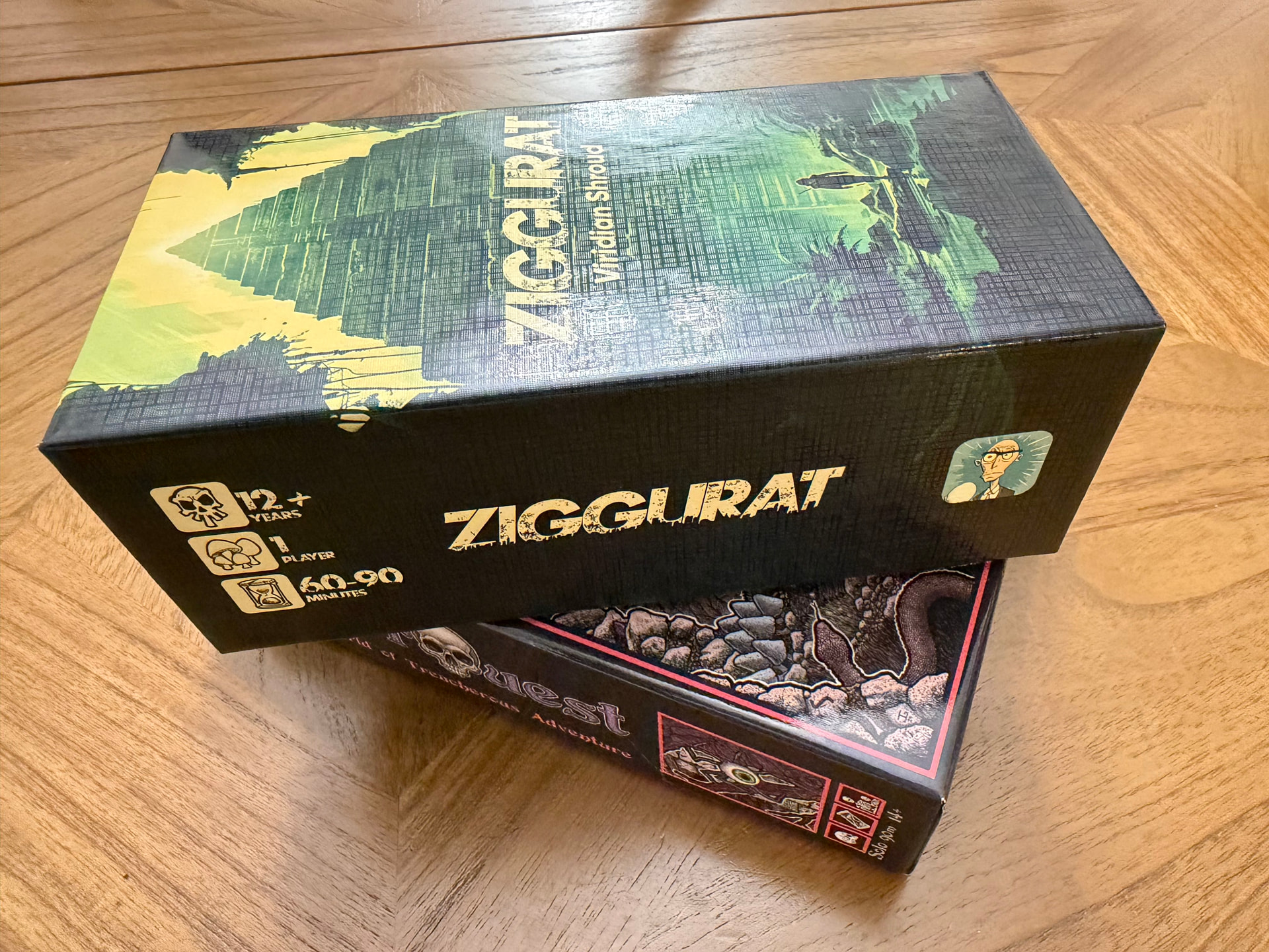
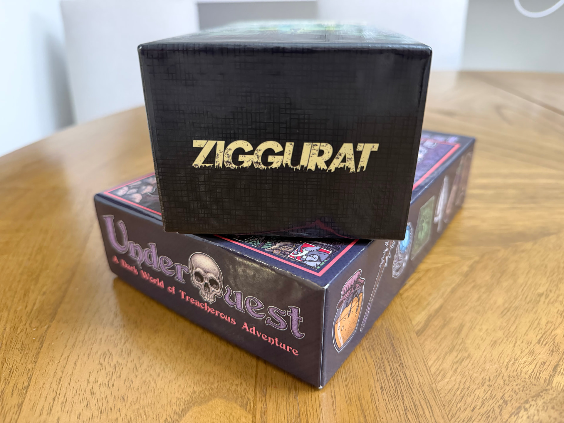
Very interested to here your feedback on the quality of the physical components direct from Game Crafter. Need to get a feeling for how far from a saleable product we are ![]()


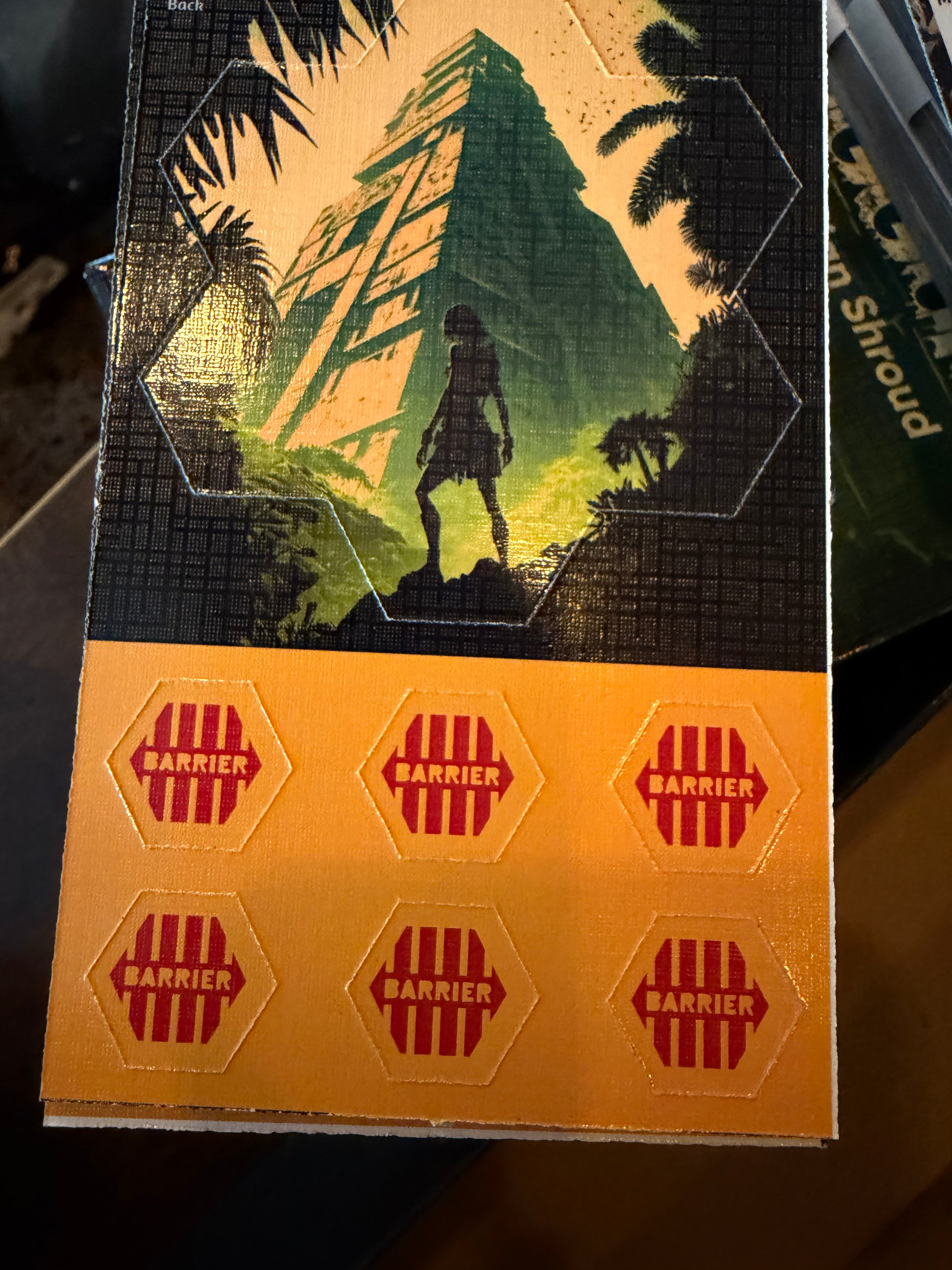
BTW the weird grid pattern in the cards is likely the « linen finish » which is a more expensive finish to the card stock. Is it worth it?
Not this version of linen. I took a look at the Wingspan cards, which have a linen finish, and those look normal. The finish on your cards is inconsistent and very shiny. At some angles, the artwork is almost impossible to see.
1 Like
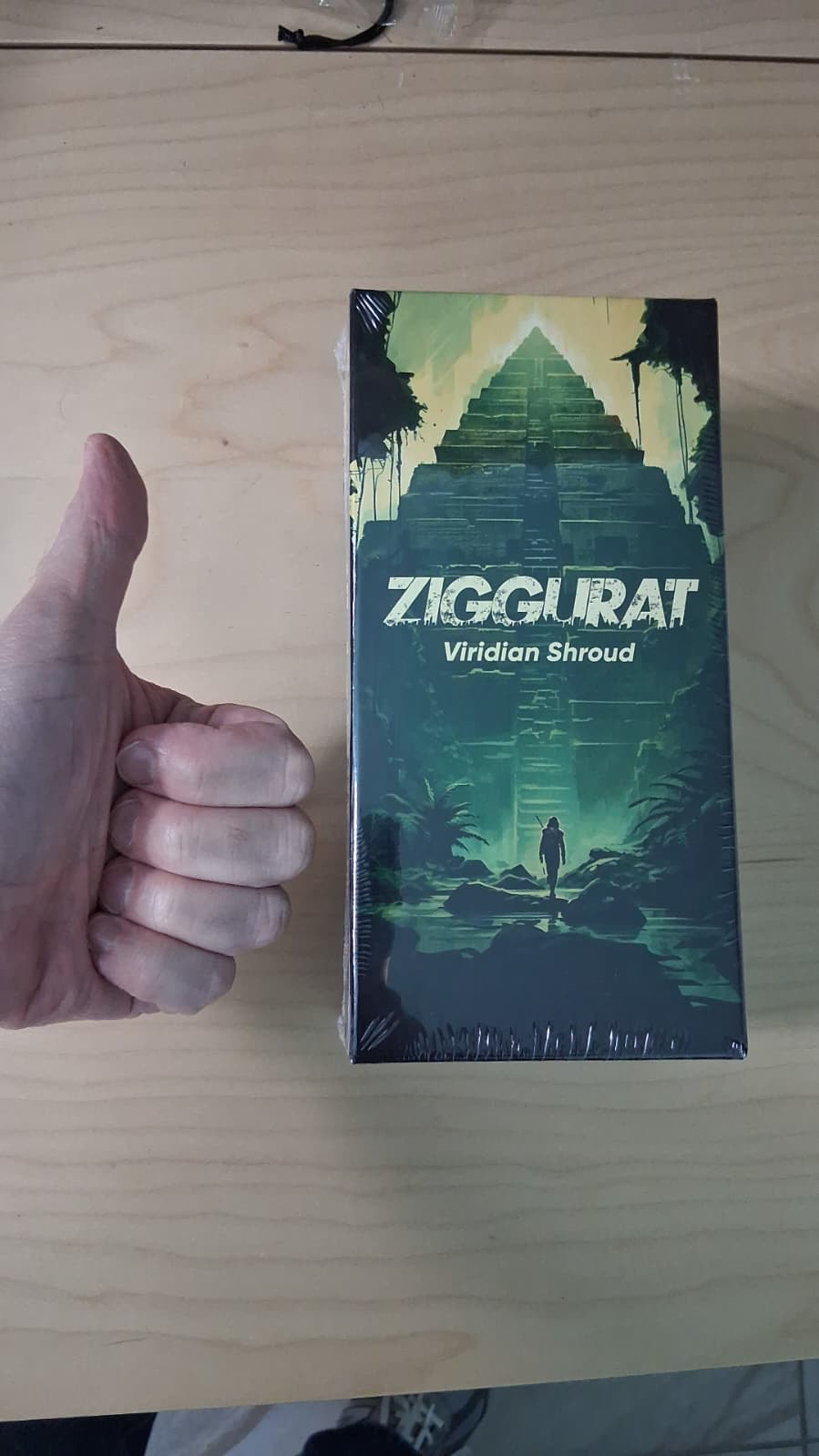
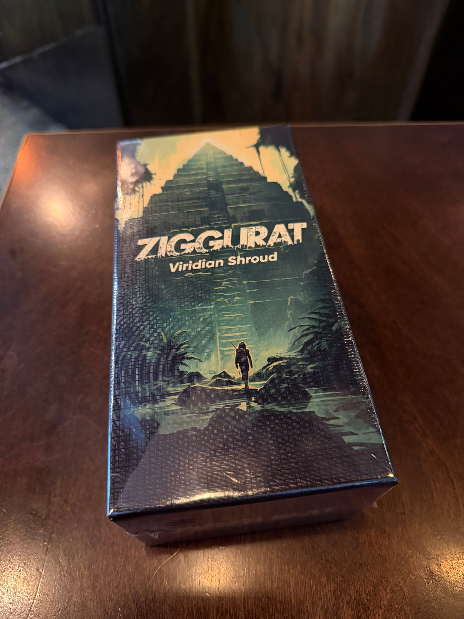
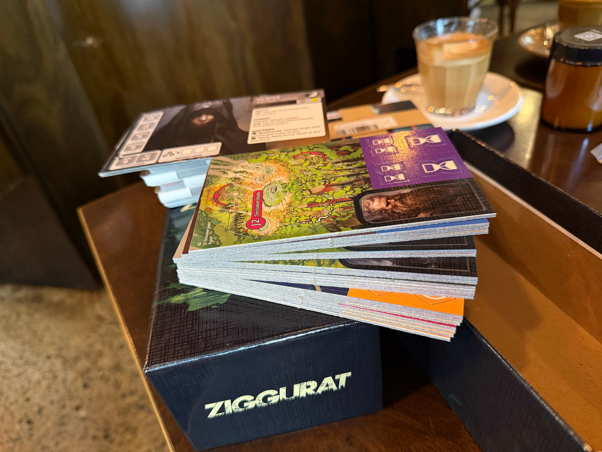
Mine arrived today – Huzzah ![]()
The only drift I could find across all cards and slugs was in the POI and exploration tokens. Something to look out for.
Otherwise the cut-outs are very good. An epic improvement on the old laser cut cardboard – it use to ship as a bag of soot.
All punched and packed away.
I recently got a copy of Underquest from Game Crafter; UV coating, with no linen finish. The difference is quite pronounced, especially on the jumbo card surface areas.
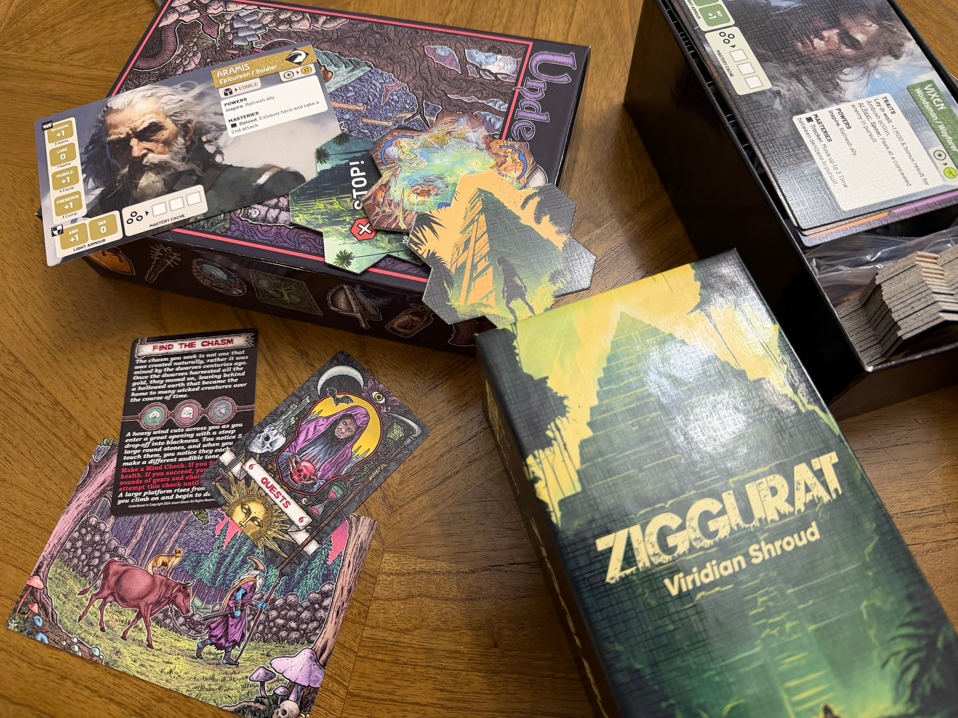
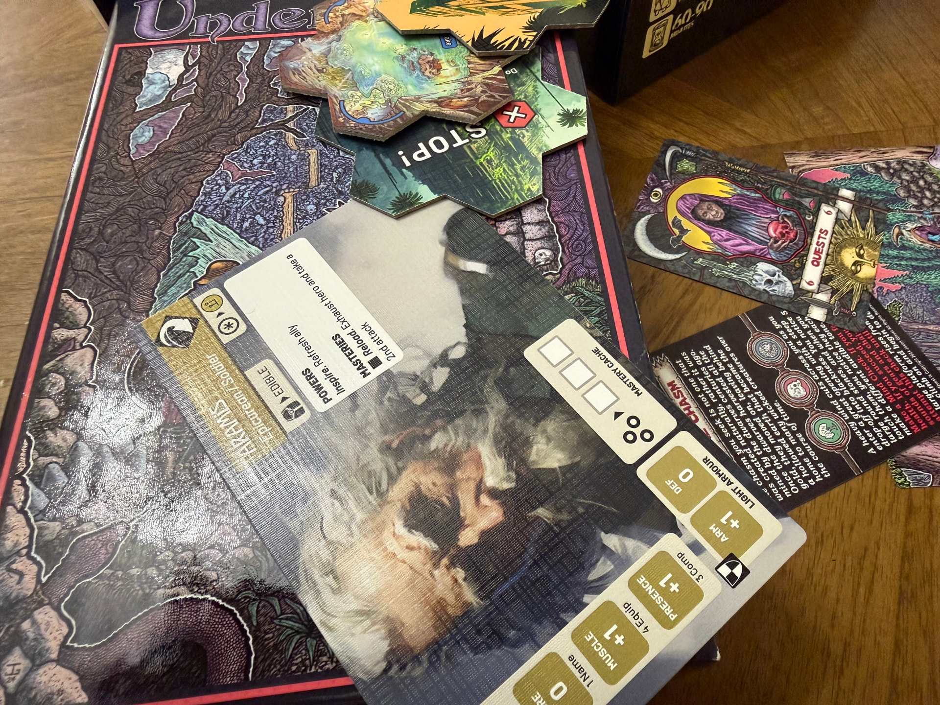
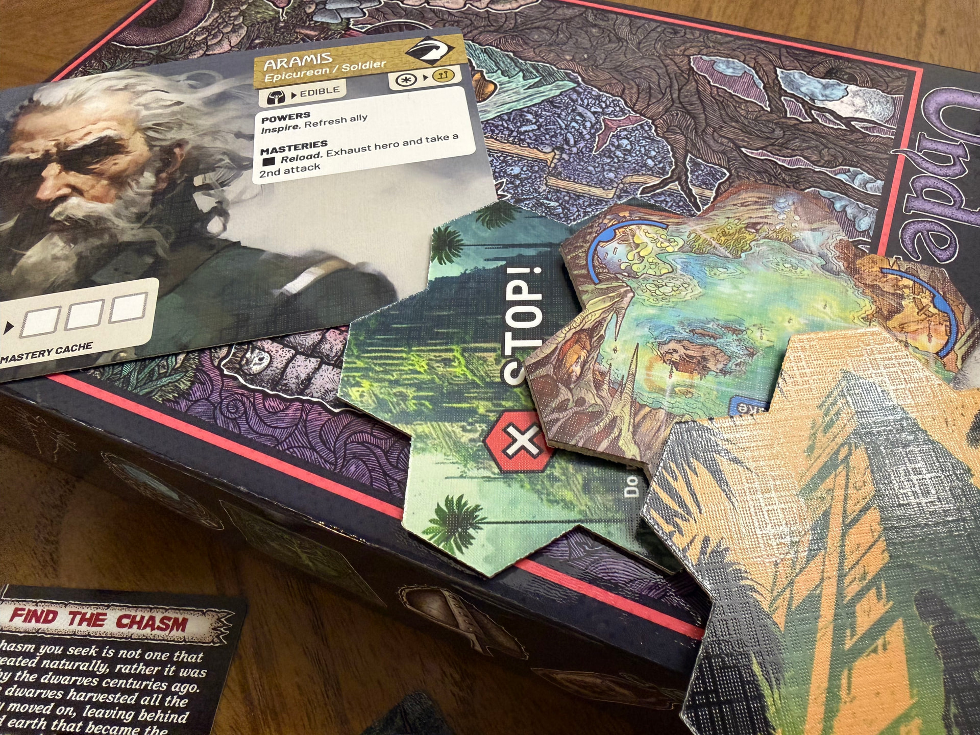
The linen finish is a product wide finish that even includes the box. Makes me think it might be a faux linen finish, like a surface treatment that emulates a linen finish.
The linen finish is supposed to improve durability and shuffling. But seeing as only the loot deck is regularly shuffled I don’t think that will matter much.
Conclusion… I think we dispense with the linen finish and save 25c per sheet.
PS. I seem to remember hearing a discussion with Jason Glover (designer of Ironhelm and Underquest) about how he preferred not having linen.. i think I see why now.
Last night I printed up the rulebook, cheat sheet, glossary/index, and player aids – but I haven’t read any of them. Today I’ve had a chance to sit down and unbox the components.
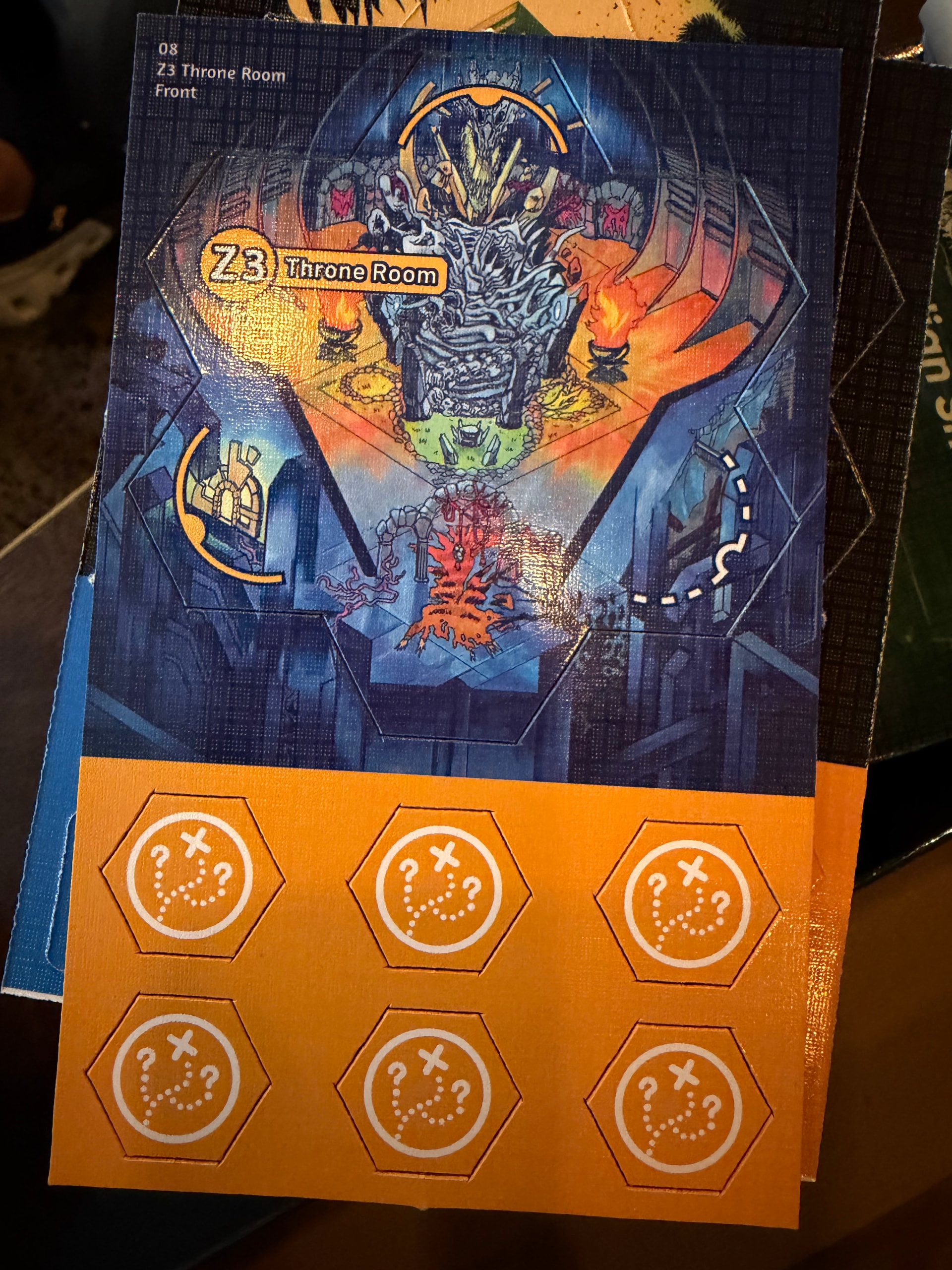
I set aside 8 of my slugs as having no alignment issues at a glance. The others are shown in the image below:
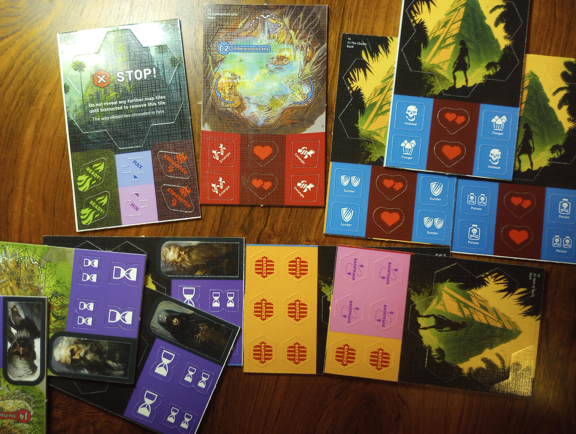
I think it gives an indication of the tolerances/variances that could occur from copy to copy: greater than in a large-scale manufactured product. It is interesting to note that the lower half of the slugs seems more prone to mis-alignment; that is probably down to some idiosyncracy of their manufacturing process.
Nothing here is game-breaking by a long shot or even especially upsetting, I get that it’s print on demand etc. etc., – I’m not complaining, just reporting. It’s largely baked into the nature of the TGC offering, and something you as the creator (and folks as buyers) have to tolerate. But there are 2 things that I think could possibly be improved on the slugs by revising the graphics/ proofs on your end.
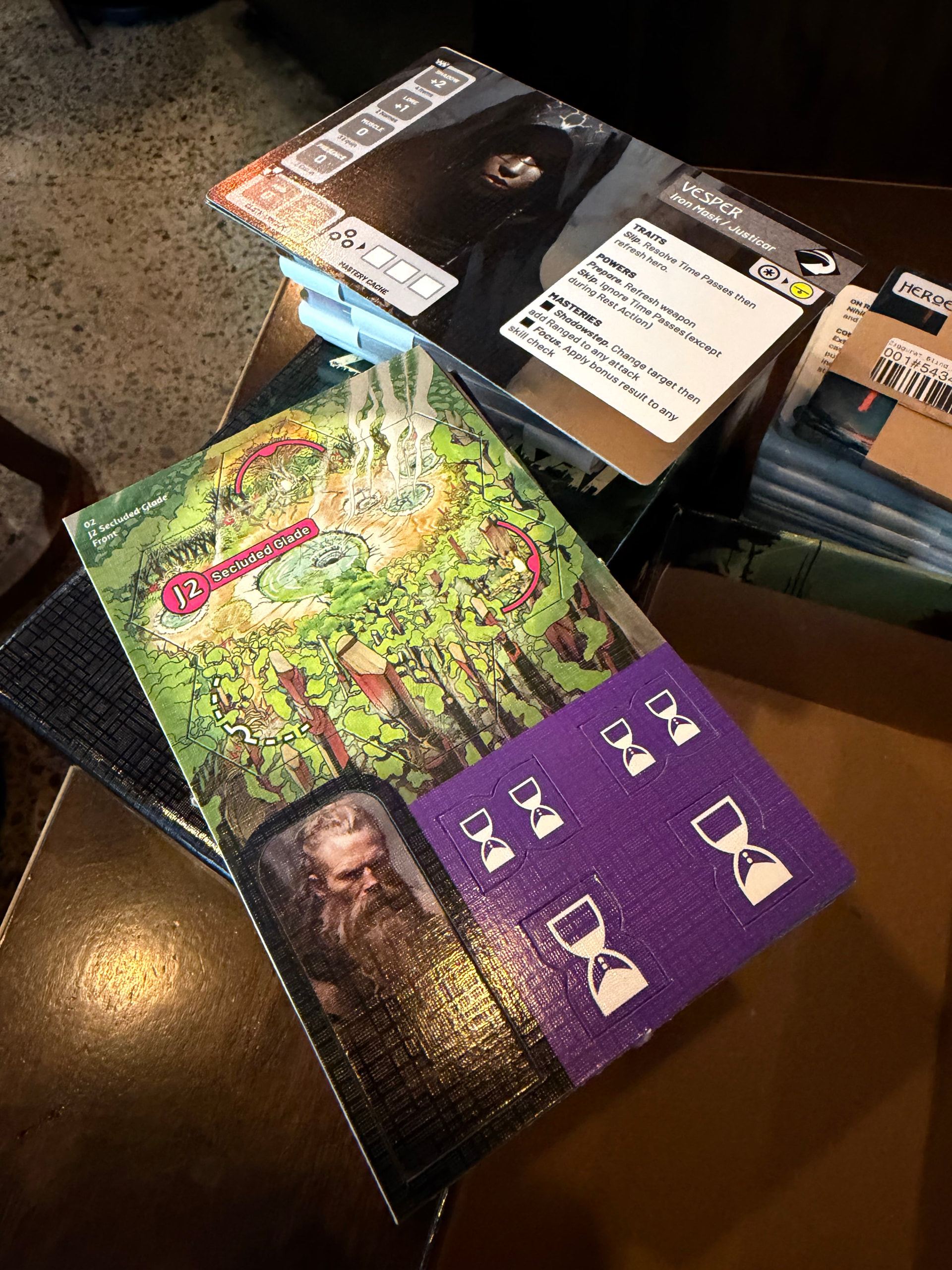
- Squint at Vesper’s standee, and you’ll see it has a thin black pillar on the left of her face since the cut was misaligned. Most of the standees came out fine, but note, that seems to be sheer luck as there is zero bleed around the portraits, and thus zero margin for error. If you were to expand the standee images with a bleed – simply by including more of the portraits as shown on the character cards – those black pillars would become impossible, and a clean portrait would be ensured.
- The small triangular arrows/carrots on the Min ans Max tokens likewise leave zero margin for error. Rather than hoping the cut aligns with the darker indicator color of the triangles, you could just put a large ugly square of the indicator color down at the business end of the token, and let the cut decide where it falls. Then no matter where the cut happens, the remaining corner of the token would be covered in the darker indicator color.
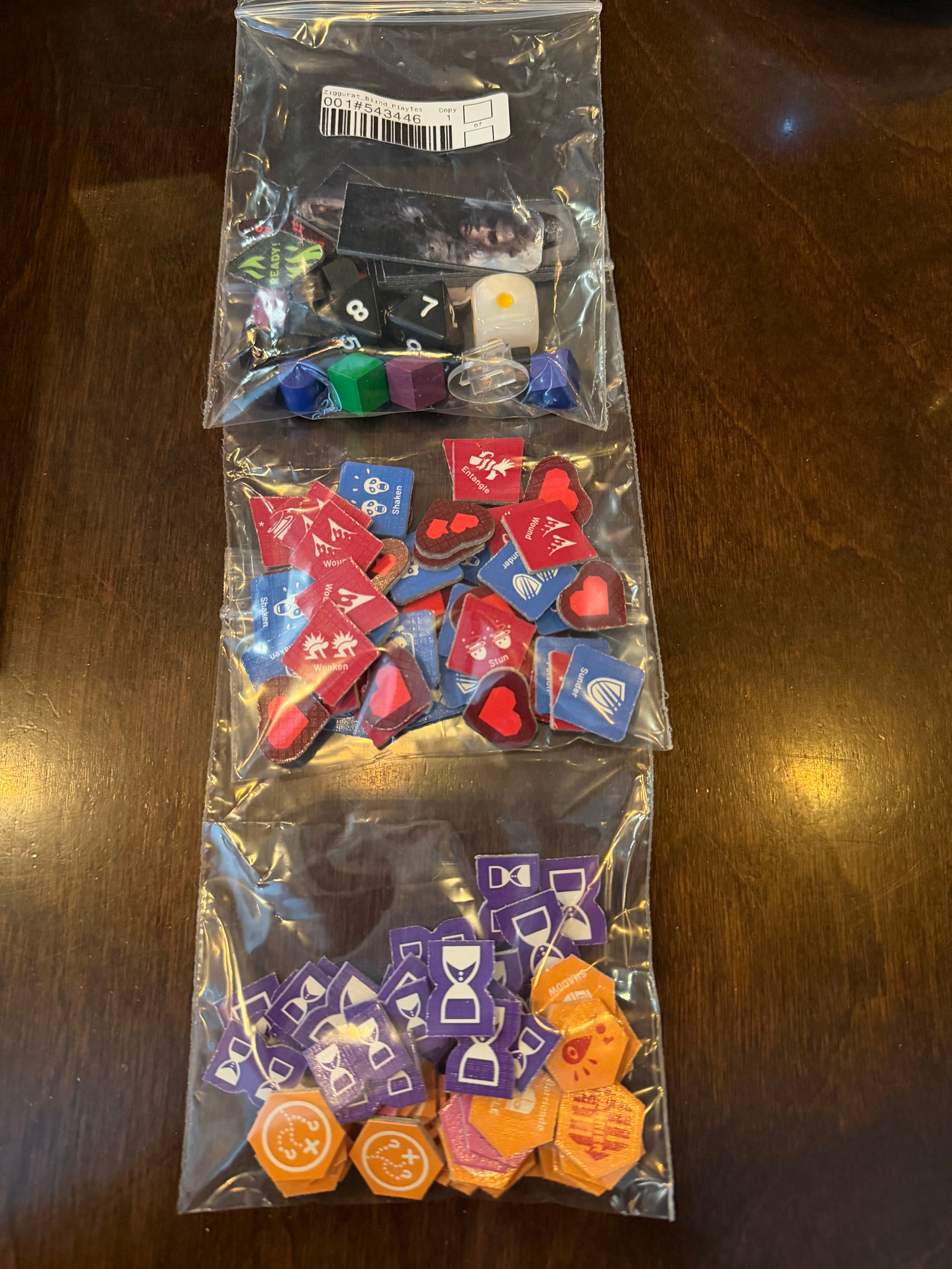
Unlike some other folks I don’t mind the (faux) “linen”(-ish) texture, and personally I think I might prefer these to the smooth cards used in most of TGC’s printings. Those always felt cheap to me, like a novelty pack of animal-themed playing cards you might buy at a local zoo. These feel nice. I would only note that the patterning can occasionally be a little smudgy. This is rare from what I see so far, but go back to the image above and squint at the lower portion of the slug for C2, underground lake. Running vertically along the left edge of the heart tokens, you’ll see smudges. That wasn’t me, it’s just a spot where the texture didn’t come through quite right.
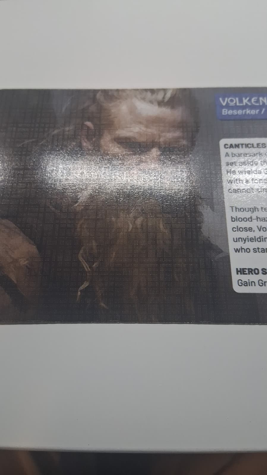
The only other thing I’ve looked at so far is the character bios on the backside of the character cards. I’ll share the one thought/tagline I had formulated on that: “Savortext, not flavortext.” Reading the writing isn’t effortless and I can’t quickly skim it t pick up on vague themes, but in pausing to read it, I find it frequently rewards my effort.
Cheers. And thanks! This looks dope. I’m about to step back to the table and I’m looking forward to exploring more of the goodies.
Do you have a recommended soundtrack?
1 Like
I sat down to try to wrangle the cards. TLDR: I do think a tiny bit more assistance could fruitfully be provided to players so they know what to do when they first sit down. I’ll walk through my experience and point towards a few suggestions.
To get my bearings I thought I should first look to the Learn to Play file (for the first time – using the latest/living v.04). The first sentence/paragraph reads (at time of writing):
“Read the rules in conjunction with this guide – this is not a substitute for the rulebook but a guided path through the tutorial quest.”
I am not physiologically capable of reading one text strictly in conjunction with another, so I figured I’d need to tackle them in sequence. Since I hadn’t yet understood what was in the box, I wasn’t ready to be jumping into any tutorial quest. Thus, the Learn to Play guide had immediately communicated to me that I should read the rulebook instead. I set the Learn to Play aside.
I looked at the rulebook for the first time (v0.13), and page 4 seemed to invite me to participate in taking an inventory of components, which was just what I was after. (I what follows I will refer to pages 4 and 5 of the rulebook as “RB45” – I wasn’t ready to do Setup, so I stopped reading before getting to page 6).
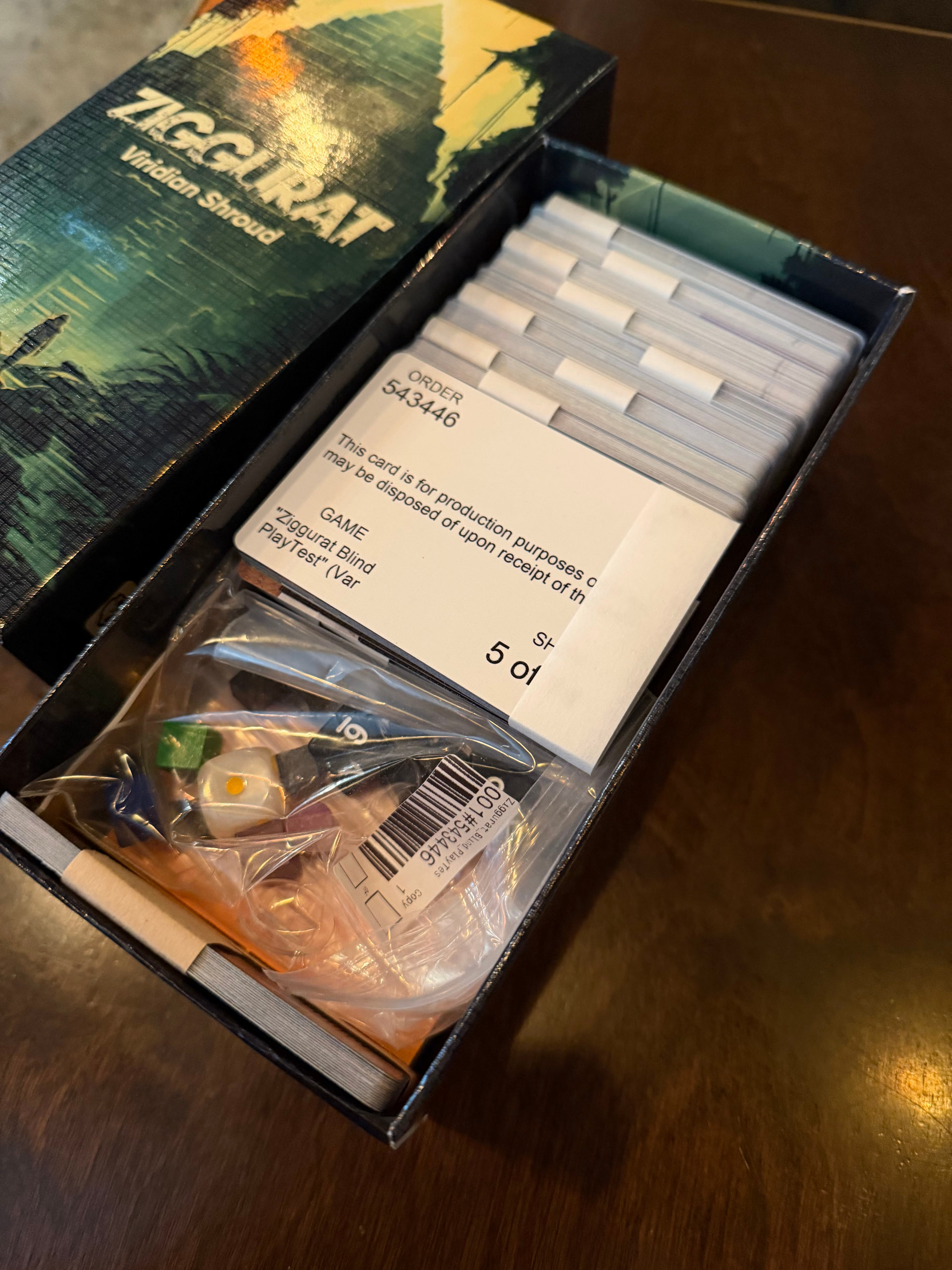
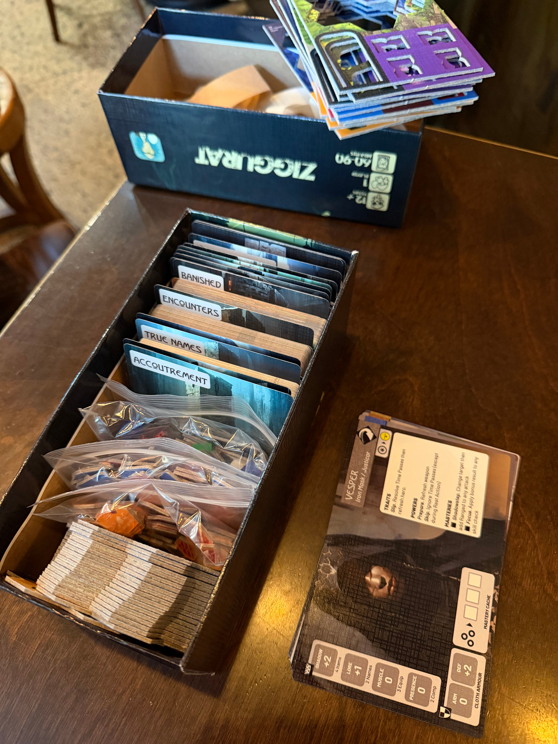
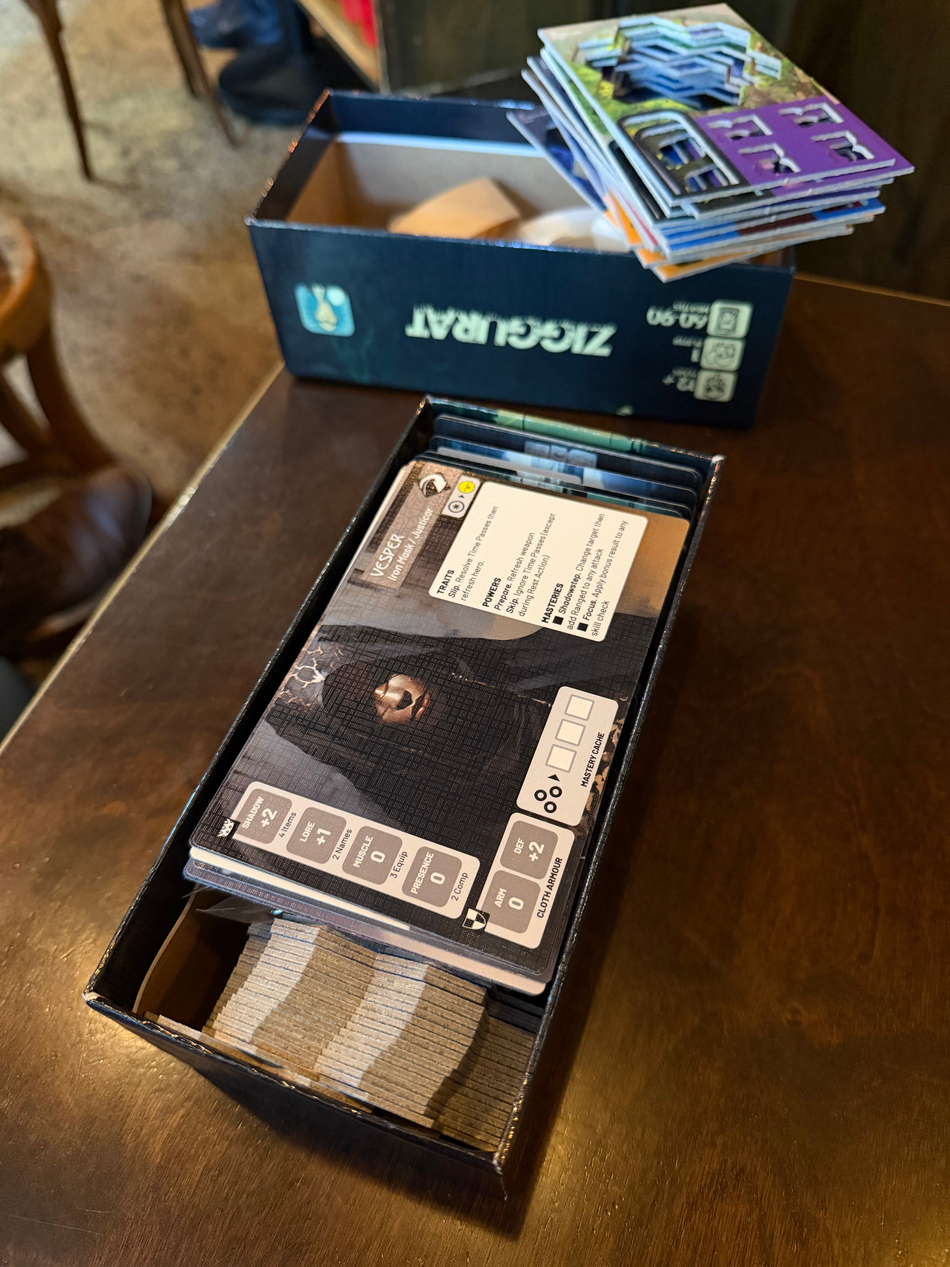
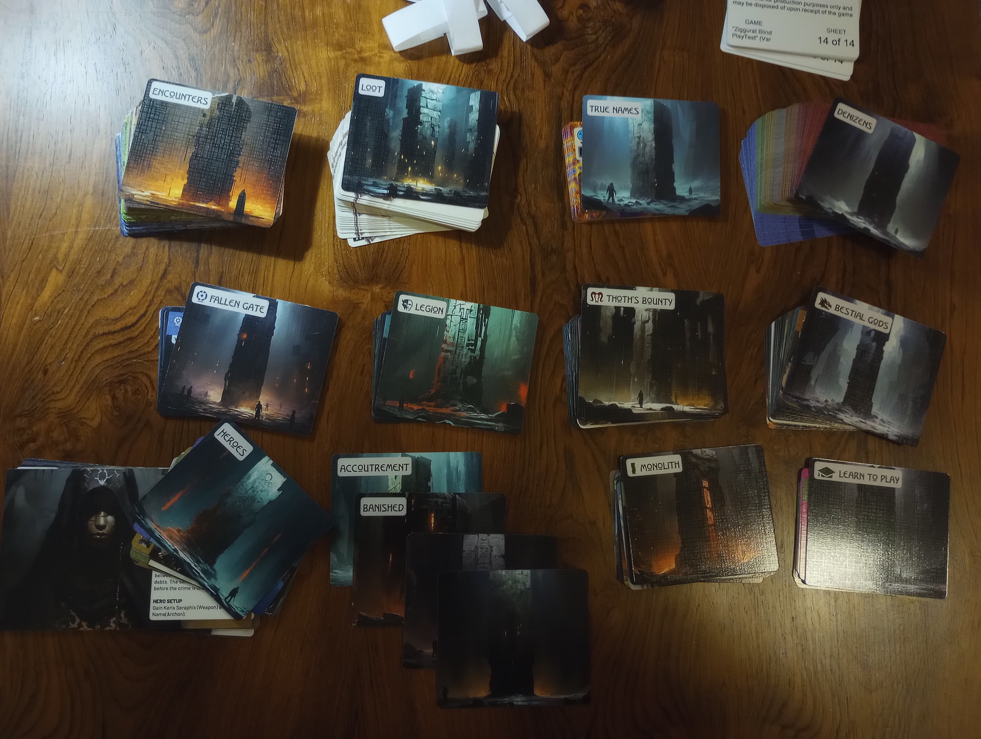
I had already seen and examined the oversized Hero cards, so I started at the poker-ish sized cards. First I confirmed that all 14 of the paper-banded “packs” were present, stacking them in sequence using the “for production purposes only” cards that TGC provides. Then I started opening them up in sequence.
Pack 1 greeted me with the “Learn to play” Vignette cover card, and it seemed clear that the fluorescent pink borders were important. The “Learn to play” Vignette cover card suggested that I should find 10 cards for the Learn to Play, and indeed – after looking on both sides – I found 10 pink bordered cards and set them aside.
After this initial success in sorting the tutorial, I putzed through about half the packs feeling a little lost. It was quickly apparent that I would not be able to continue applying this rule of looking for a color to sort decks into suitable piles. I gathered that I would need to start looking at iconography and card layout to try to work out what went where. Slowly a few patterns started to emerge. I started to bank on those patterns to vaguely sort things into piles, while waiting for greater clarity. Here were some of the tasks/piles that I ran through in parallel and how I tried to puzzle them out.
- Some cards (in portrait layout) had small images of the Heroes and looked to be their weapons and starting companions. I noted that RB45 didn’t provide me with any information about the Heroes’ companions, but since I had read the Hero cards, I figured they should all go together, so I added them to a pile with the weapons.
- Like the Hero weapons, another card in portrait layout was a second Street Urchin character card, this time without any pink border (if you check both sides). I set it aside with a handful of other cards in portrait layout that did not seem to be associated with heroes (Maboon Jawbone, Scented Skin, Vermis Symbiote, Xantheia the Sibyalline, Divine Vessel, – etc.). A glance at RB45 did not tell me what these were. I thought of them as the “Mystery Portraits.” I made a pile and moved on.
- Some cards (in portrait layout) had distinctive card backs that clearly suggested distinct decks. A glance at RB45 told me these were the 6 Faction Decks, comprising 54 Denizens. I sorted each Denizen deck as I worked through the packs. When I was done I confirmed the intuitive count of 9 to a stack. I noticed that only a single oversized divider card for Denizens was provided, so I stacked all 6 decks together (in alphabetical order by cardback) with the divider on top. I assumed I shouldn’t shuffle them all together – maybe Setup will tell me different.
- Some cards (in landscape layout) had books in the top-left corner of one side with distinctive Icons on the left page, which seemed to designate decks. At a glance, nothing in RB45 told me what these “Book cards” were. I wasn’t sure what the different colors of books meant, but I decided that the Icons were probably more important. So stacked them into groups by Icons, and then within each group I ordered books by number/color/dagger-count. Later, I realized that these were the the Icons for Vignette & Saga Quests (Thoth’s Bounty, Fallen Gate, Legion, Monolith, and Bestial Gods). However, a glance at RB45 showed me only the “cover” cards for each Vignette and offered no count or inventory of the cards associated with each Vignette. I wasn’t sure where they should go.
- Only later did I realize that the Vignette & Saga Quest cover cards (picturred in RB45) tell me that the Quest is in some sense associated with (e.g.)
- n1 Quest Cards,
- n2 Threat Cards,
- n3 Set Aside cards, and
- n4 Peril Events.
- Some of the Vignette & Saga Quest cover cards explicitly told me that their “Set Aside Cards” were some of my Mystery Portrait cards. In some cases the Set Aside cards were not explicity named, but the counts and Icons suggested a match to my Mystery Portraits. So, relying on Icons, I stacked my Book Cards, Mystery Portrait cards, and anything else with the right Icon under the correspondngin Quest cover cards. I had to deduce all of this from the Cover cards and iconography. Nothing in RB45 showed or told me any of this.
- Encounter, True Name, and Loot cards were easy to identify. Along the way I kept laying the oversized Divider cards on top of each pile.
By the end of this process, I was here, with only a handful of divider cards (Accoutrement, Banished, and 3 blanks) having no assigned place:
From here, it’s clear to me what the Map Tiles are, and that’s nearly all the components…
This all came together without too much hassle – it took me longer to write this than it took me to do it. However, I did feel an initial sense of bewilderment, and I think RB45 could be improved in a few key ways.
- The Hero-related portion of RB45 might ideally include a count of their starting companions, not just their weapons.
- I notice that all of the Learn to Play cards must be flipped/viewed on the correct side to see that they have the fluorescent pink piping which denotes that they belong to the learn-to-play. Unless I misunderstand and these cards have some dual use outside of the tutorial, the pink piping might fruitfully be added to the other side as well to facilitate sorting – this is especially worth considering for the Tutorial Blind Urchin, to ensure it is never confused with the version of the Blind Urchin that belongs in the Monolith Vignette.
- RB45 might ideally include a slightly more detailed, decomposed inventory of the cards that are associated with each Vignette & Saga. Peril cards are labelled clearly enough. But minimally:
- RB45 should draw attention to the inventory that is printed on each Cover card, and
- RB45 shoudl ideally tell and show the player that Book-Cards-with-arabic-numerals-in-the-right-hand-pages are Quest cards, and that Book-Cards-with-dagger-icons-in-the-right-hand-pages are Threat cards. The player should not need to infer this.
- RB45 might ideally list the meaning and count of the remaining components. Currently after the cards, there’s a count of location tiles, but nothing is stated about tokens, dice, or the wooden bits.
1 Like
Noted!
This is one of my fears.
The text is written in the style of last century sword and sorcery novels; especially those of Vance, Moorcock, Wolfe, Leiber, etc. Something interesting, thought provoking, hinting at a greater truth – of which there are many in the game. So not your average flavour text; an uncommon style and decidedly harder to read. Not to mention the reality that my own prose does not live up to that of the masters.
Its comforting to hear you might be enjoying it.
No. But I’d been keen to hear thoughts on suitable atmospheric tracks ![]()
1 Like
This is all great feedback.
I typically present new players with an already assembled deck box. The messy nature of the TGC assembly needs something to handhold folks through their initial contact with all the components. I thought at first a specific assembly guide, but I think you might be right in that a decent couple of pages in the rules showcasing the components in their correct groupings might be all that’s needed.
@tabicat expressed similar concerns in his unboxing video.
I’ll put some effort into updating RB45 over the next few days.
PS. As for confusing dividers…
Banished. This is a convenient place to put used location encounters, rather than taking the time to place them at the back of the relevant area of the location encounters each time.
Heroes. Defunct now that we have the large hero cards (should be blank).
Accoutrement. Hero weapons and other miscellaneous hero specific cards. A fancy word for “Hero Nicknacks”.
Have been thinking it might be better if the dividers used the artwork associated with the cards they align with; for example, loot – backpack, true names – machine elf, etc.
1 Like
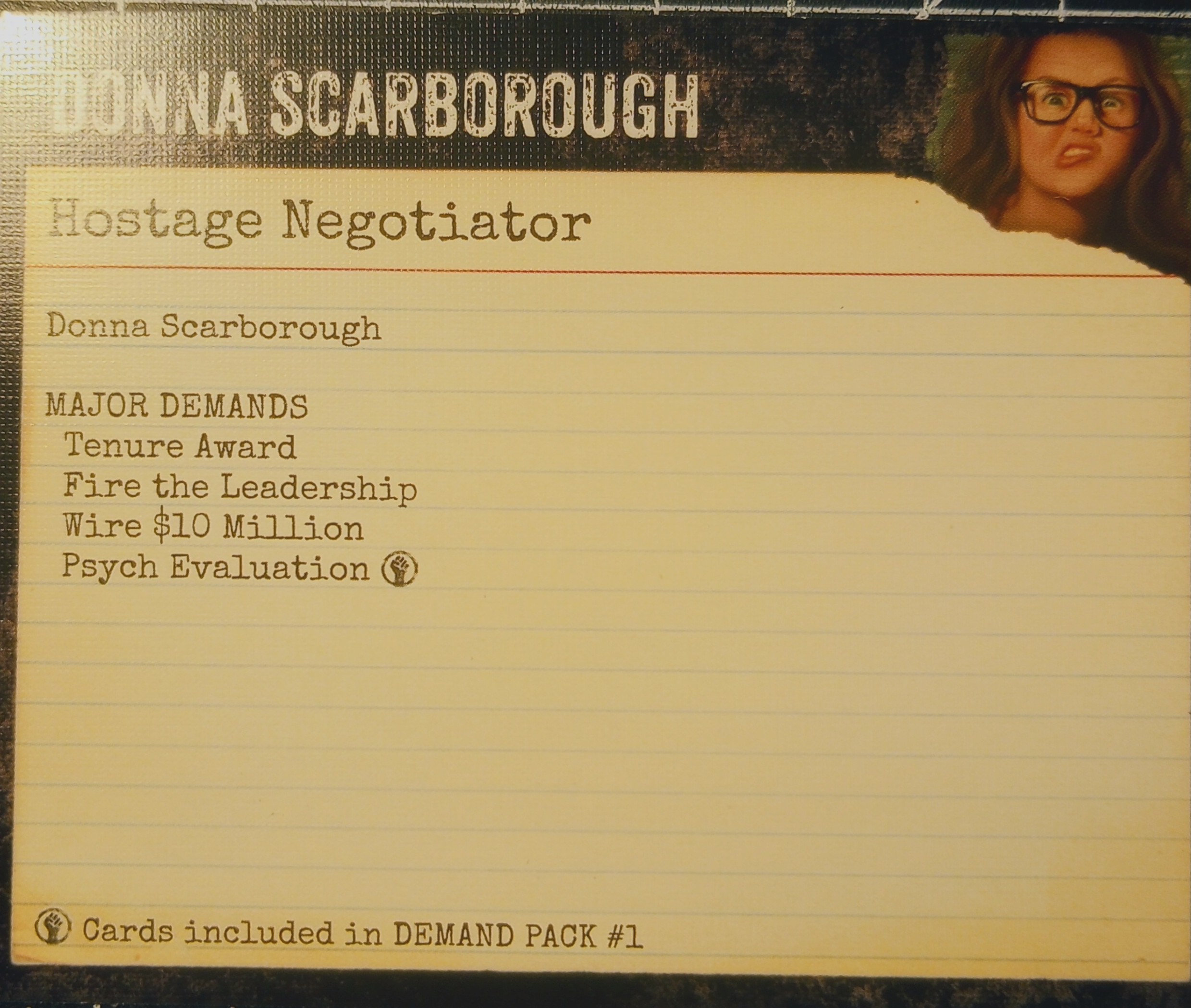
I think a division of labor between these strategies could serve you (and the player) very well. As one reference/example, in Hostage Negotiator part of setup is building a deck of demands for the adversary you’ll be negotiating with, and the oversized divider cards simply list all the major demand cards that you’ll select from randomly to complete setup. Some sit behind the divider all the time, others are drawn from a common pool (underscored with an icon/footnote):
You don’t need quite so much scaffolding, but you could rig up the dividers so that one side remains as is, with splash art and the name only, and the other side provides helpful references (names and/or counts of each cardtype, and perhaps images/icons) to help the player sort relevant cards. RB45 might helpfully walk the player through how to read/use the reference to compile the cards for the Learn to Play Vignette (explaining how the Book iconography works, what each card type looks like, etc.) At that point the player could be told to “locate the divider cards for the remaining vignettes/sagas and do the same.” Once they’re done they can flip the divider to hide the reference text.
Of course you could do all this in RB45, but I do think a division of labor here, leaning on the Learn-to-Play and exploiting space on the dividers, could help save space in the rulebook, where I assume it is at a premium.
1 Like
the first thing that emerged from the depths of memory was the soundtrack for AZAG, which I think is intended to be conceptually akin to Ziggurat, even if I don’t always hear how it aligns to its inspirations:
1 Like